What Is Good UX Design?
Good UX design creates seamless and positive experiences for your website visitors. And can keep visitors on your site longer, which may increase conversions.
In this guide, we'll show you some UX design examples in ecommerce, technology, and other industries. But first, make sure you understand what this practice entails.
For the most part, good UX design is about:
- Usability: Your website, app, or product should be easy to use and understand. On websites, customers should be able to access important pages in three clicks or less.
- Functionality: Your product, service, or interface should fulfill its intended purpose. With little to no distracting elements.
- Attractiveness: Your site or mobile app should be visually appealing. So it can leave a lasting impression on users and keep your brand top of mind.
- Searchability: Visitors should be able to quickly find what they need on your site. That's why it's important to make your search bar prominent and add helpful features, like a magnifying glass icon and filtering options.
- Accessibility: Your website (or products) should be accessible to everyone, including users with disabilities.
- Credibility: In UX design, credibility refers to the degree to which a website, product, or service instills trust and confidence.

14 Inspiring UX Design Examples
Now, let's take a closer look at some of the best examples of UX design.
We'll also focus on websites with a great user interface (UI).
1. Apple: Minimalist & Interactive Elements
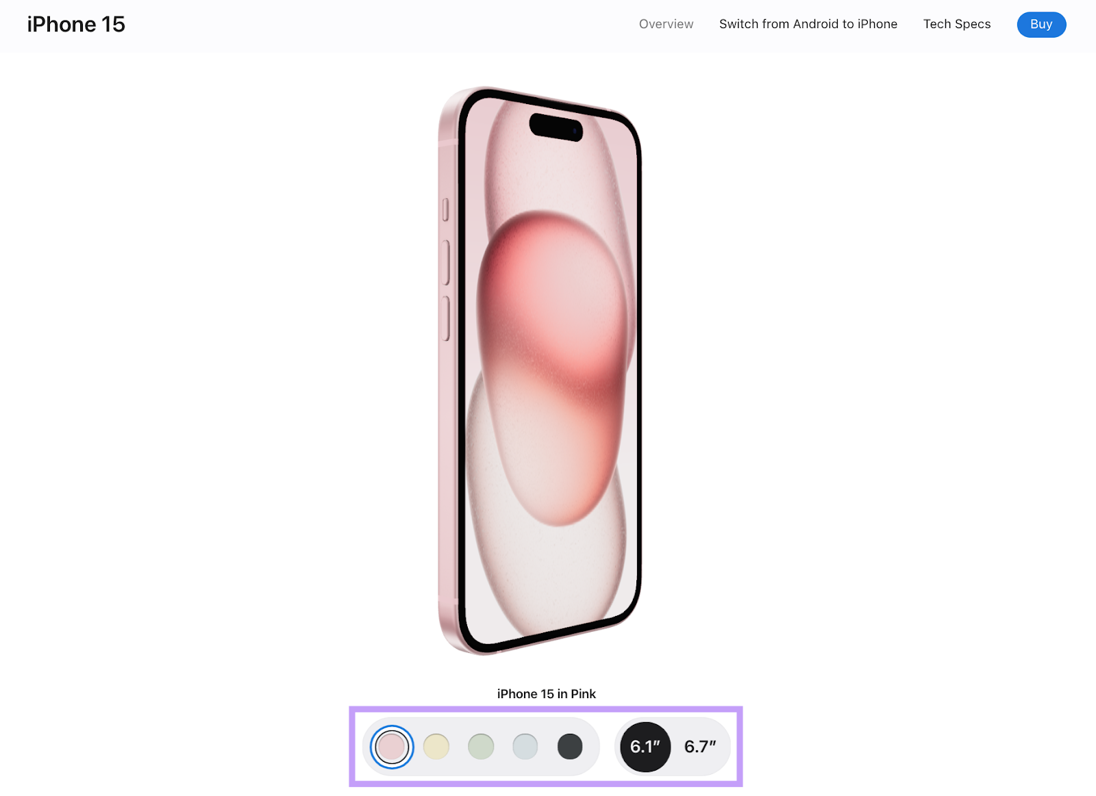
Apple’s website features a minimalist design with interactive visual elements.
It works well because of the following design choices:
- The website is easy to navigate with an intuitive navigation menu
- The buttons are all functional
- All the images are high-quality and eye-catching
- The branding throughout the website is consistent
- The website features a high-contrast color palette and readable fonts
For example, you can use the slider on the iPhone 15 product page to compare different phone colors. Or click a button to zoom in on the cameras.
And you can clearly see the navigation menu (and its contents) on every page:

2. Netflix: Intuitive UX & Personalized Suggestions
Netflix allows you to browse thousands of movies and TV series without feeling overwhelmed. By giving you a personalized experience.
Here are some notable UX design features:
- Netflix’s website has a clean interface that is easy to navigate
- The Netflix algorithm presents personalized suggests, based on user behavior
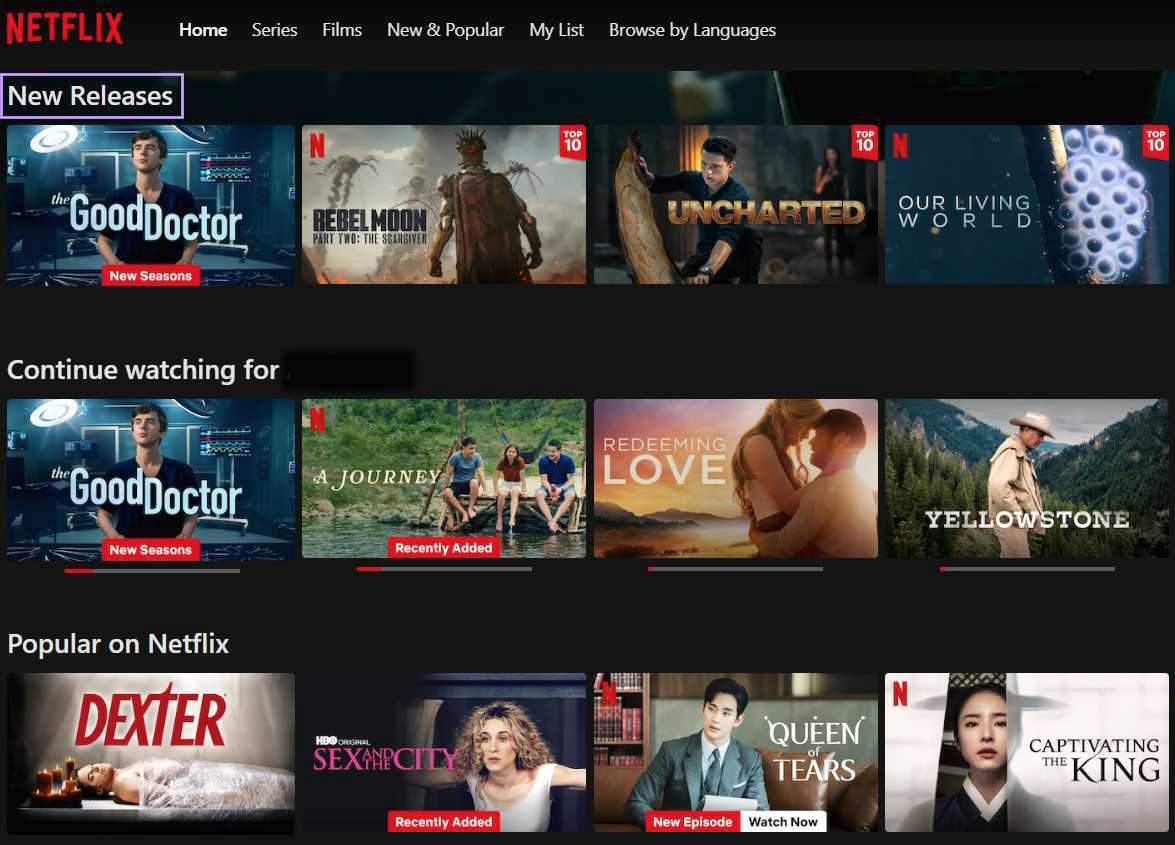
- Netflix keeps things interesting by presenting new content first
- The buttons are all useful and intuitive
For example, Netflix presents “New Releases” at the top of the homepage.
And presents personalized suggestions under “Top Picks for [User].”

3. Zappos: Searchability & Personalization
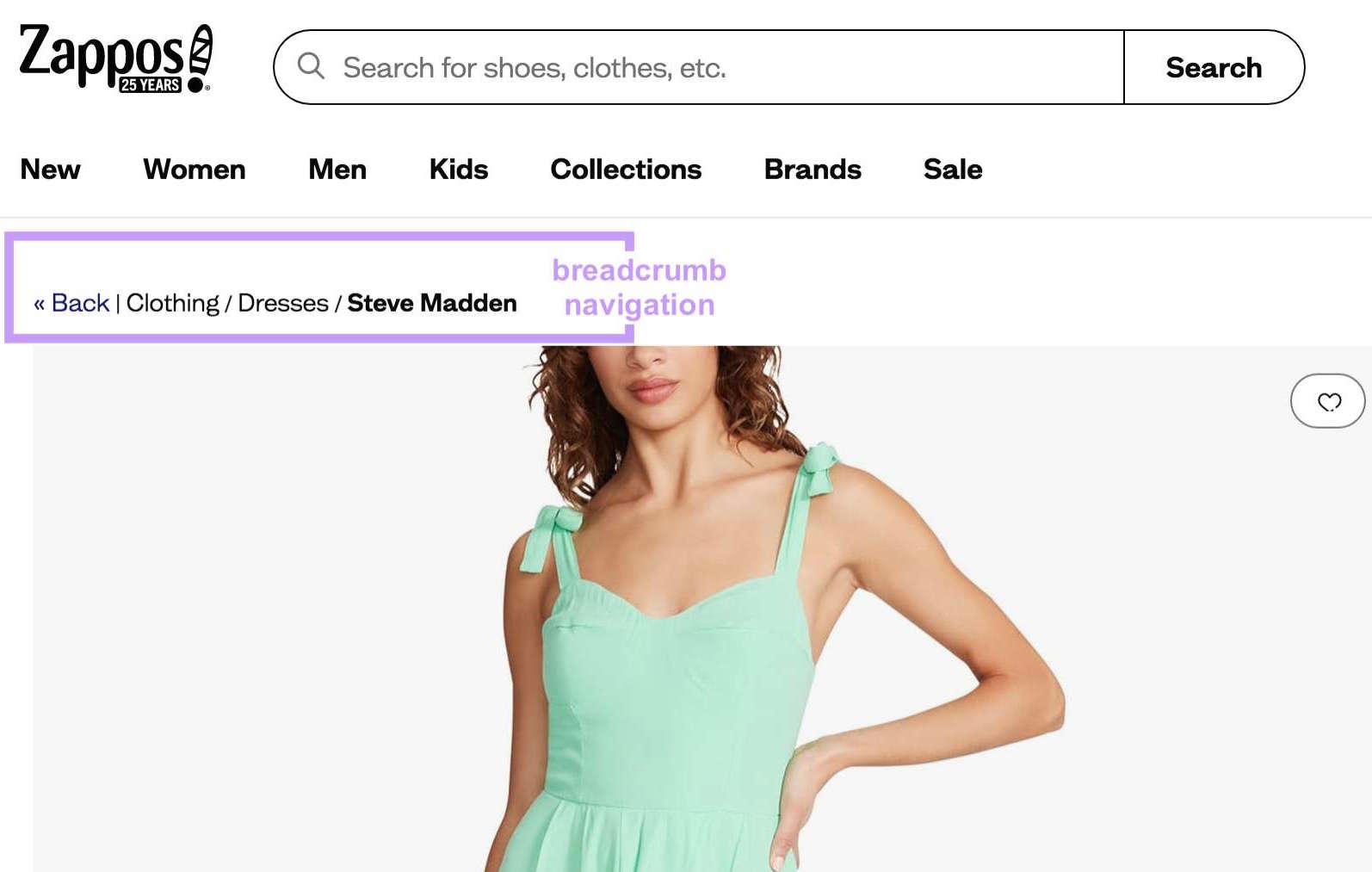
Zappos is one of the best UX design examples in the ecommerce space. They use breadcrumb navigation to make shopping a breeze.
Other key features include:
- Advanced filters for a hassle-free shopping experience
- Quality product photos taken from different angles
- Personalized recommendations, such as related items and complementary outfits
- Page zoom for increased accessibility
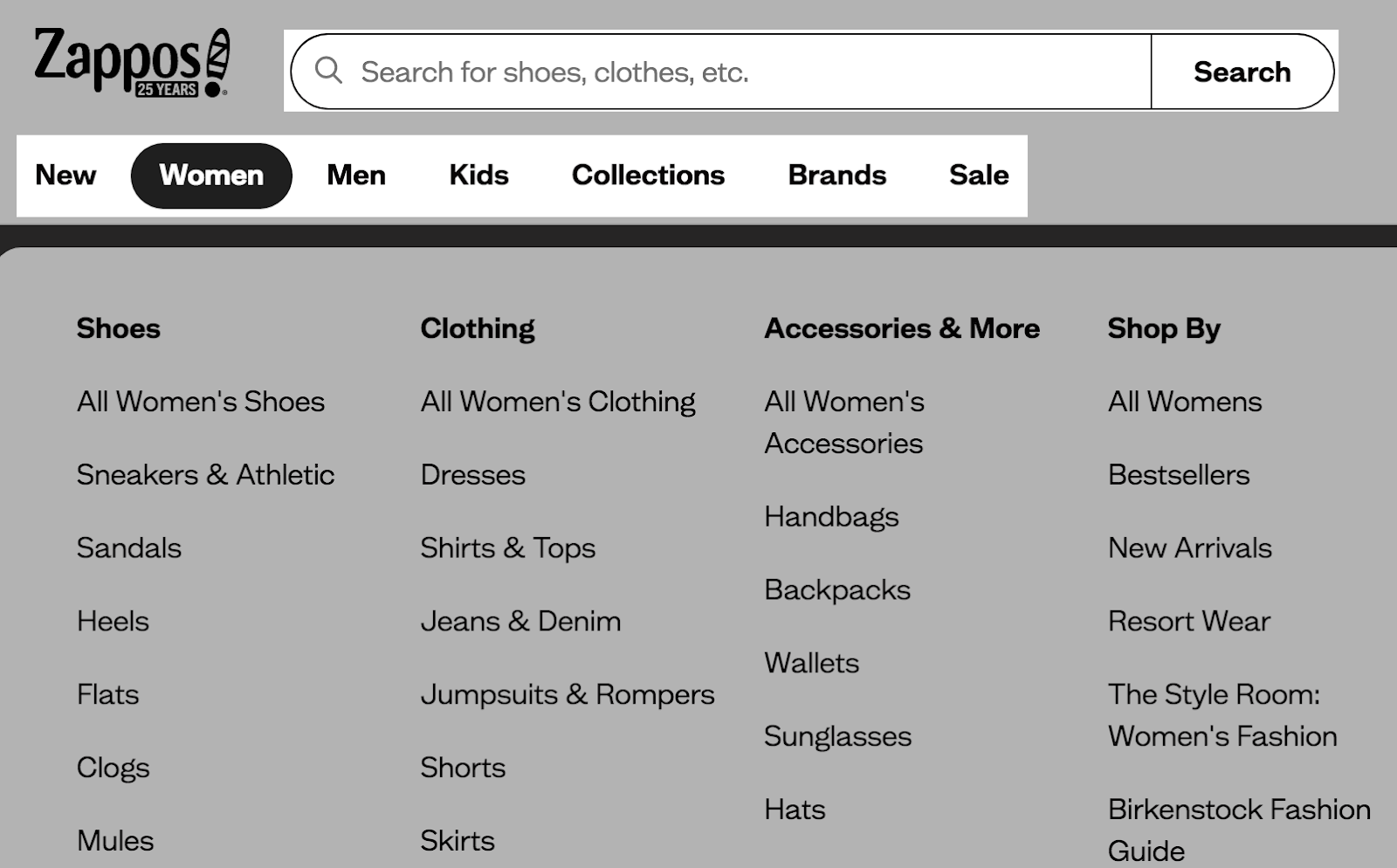
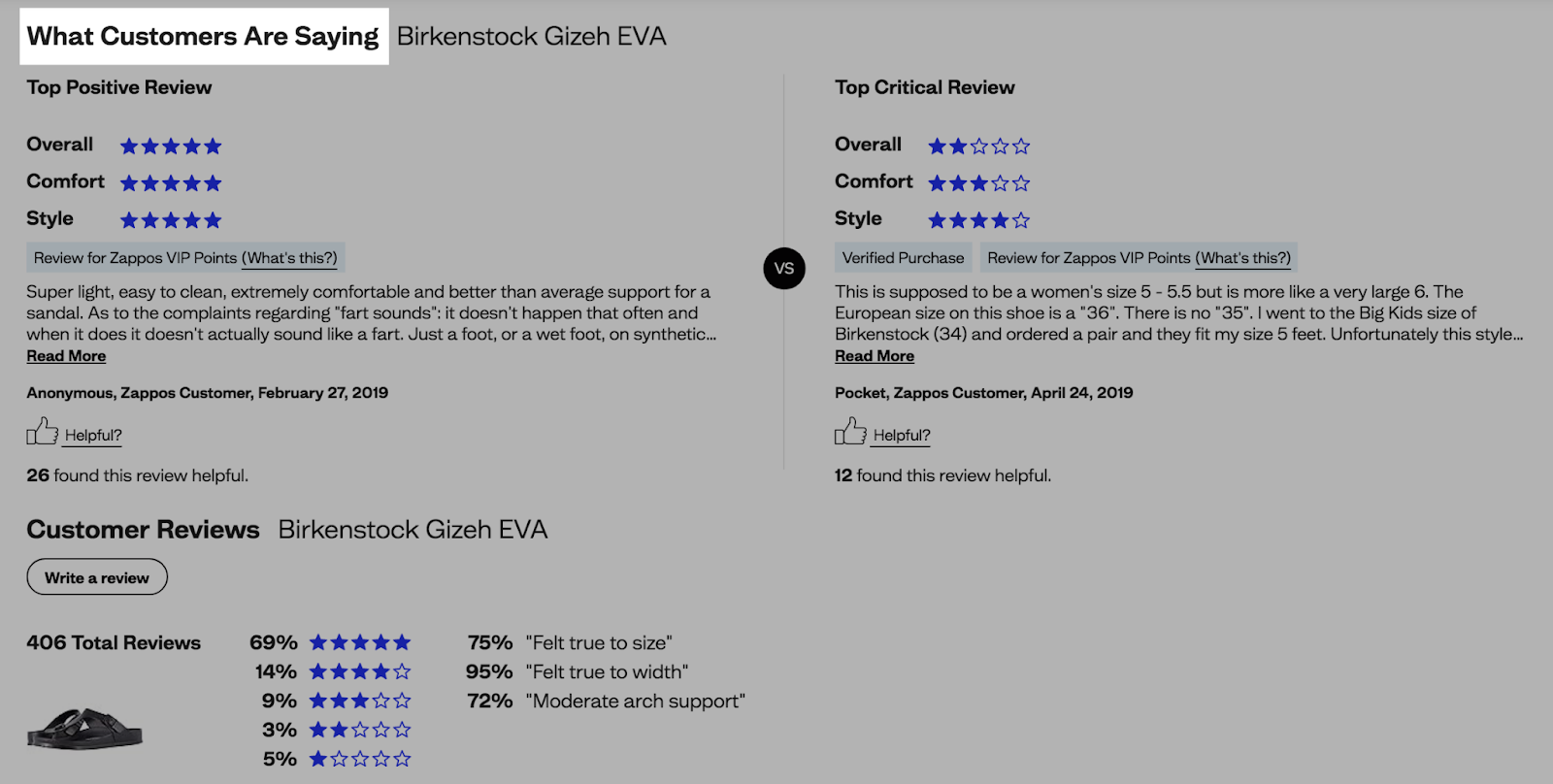
Zappos's website also features a search bar on each page. And an intuitive menu that lets buyers find what they need in a pinch.
The online retailer also displays customer reviews, which build trust and credibility.
4. Spotify: Custom Playlists for Music Aficionados
Spotify is like Netflix for music. Users can browse thousands of songs and podcasts, create playlists, and search for content.
- Its website features high-color contrast, large buttons, clear labels, and other accessibility features
- It also has a clear visual hierarchy, allowing users to switch between playlists, discover new songs, and take the desired action (e.g., embed playlists)
- The bold typography and vibrant colors contribute to the brand’s visual storytelling
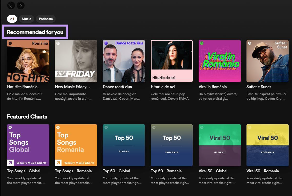
The platform offers custom recommendations based on the user’s location, preferences, and browsing history. These features enhance the user journey, allowing for highly personalized experiences.
Another cool feature is Spotify Wrapped, an annual campaign centered on the listening moments that defined the year. It leverages user data to display consumers' listening histories.
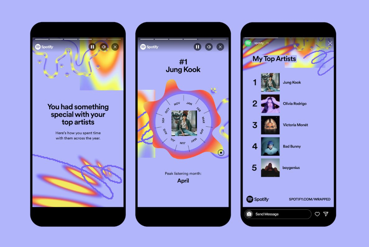
The familiar "story" format and users' ability to easily share their favorite music with friends drive engagement and brand awareness.
5. Trello: Custom Workflows for Seamless Collaboration
Trello enables users to personalize workflows. They can create to-do lists, manage projects, assign tasks, and grant permissions.
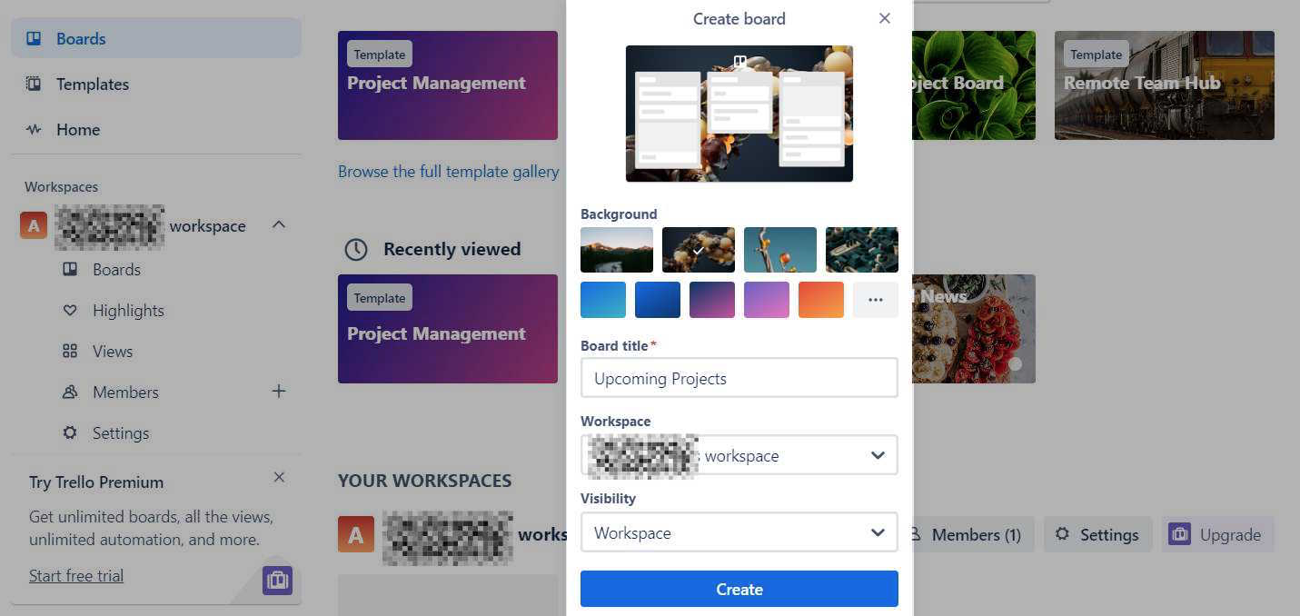
The platform stands out in the world of UX design for its emphasis on user control. It allows for personalized digital experiences and streamlined functionality.
- Its clutter-free interface streamlines the user journey, eliminating distractions
- The drag-and-drop functionality makes it easier to customize your dashboard
- Placeholder text takes the guesswork out of navigating the interface
Think of Trello as a whiteboard where you can visually organize tasks and collaborate with your team. Its interface makes it easier to break down complex projects into smaller chunks and stay ahead of deadlines.

6. Nike: Visual Shopping Experiences for Global Customers
Nike's website is highly visual. It uses lifestyle product shots that immerse customers in the brand's universe.
The images are vivid and realistic. Making it easy for potential customers to imagine themselves wearing Nike’s products.

Other key features that make it one of the best UX design examples are the following:
- Nike’s website has a clean, minimalist layout in neutral colors, making the products pop
- Its product pages provide all the information you need to place your order
- The brand recommends products that complement the item you want to buy to help you build your outfit
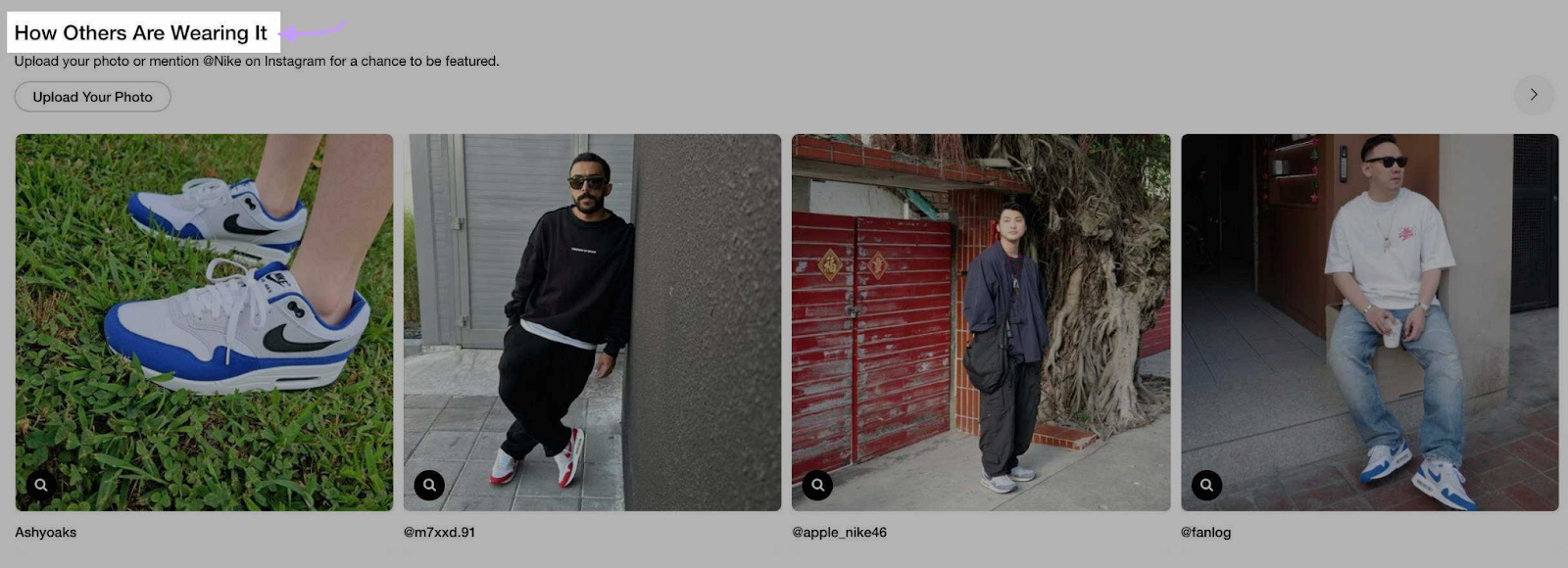
Nike also leverages user-generated content to establish trust and guide customer decisions.
Its product pages feature a section where buyers can see how others wear their products.
7. Airbnb: A Perfect Mix of Function and Aesthetics
Airbnb’s design incorporates interactive elements for a dynamic user experience.
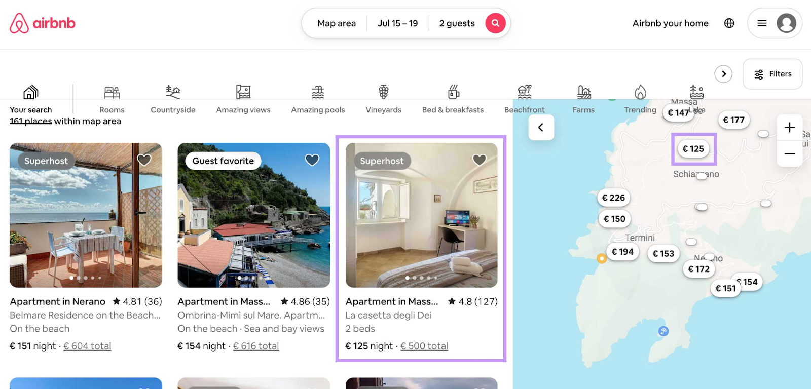
For instance, it has a map feature that allows travelers to see the area of each listing. Users can zoom in or move the map with the mouse to show new listings.
Other notable elements include:
- A user-friendly interface that allows users to find the listings they want
- Personalized recommendations based on search history and location
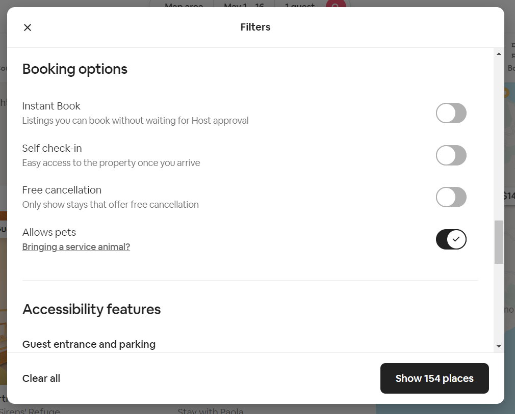
- Intuitive search and filters that allow users to only see listings that they’re interested in
The website's search and filtering options are top-notch. Users can search for accommodation by date range, category, accessibility features, and other criteria.
Airbnb puts users at the center of the design process. The autocomplete function, intuitive search, and personalized recommendations make booking easier and faster, no matter their language or technical skills.
8. H&M: Seamless Navigation and Advanced Filtering Options
H&M enables users to search by product category, popularity, activity, and other criteria straight from the homepage.
Its website is a prime example of good UX. In addition to a clean, modern design, it features:
- High-quality product photos with zoom-in functionality
- User reviews and ratings, which serve as social proof
- Custom recommendations based on browsing history and previous purchases
- Guest checkout so that users don’t need to sign in to buy
- Visual search (available on the H&M app)
The mega menu, which organizes a wide range of items, is the primary form of navigation.

Breadcrumbs allow users to see their location and move between store categories and levels. These elements serve as a secondary form of navigation.
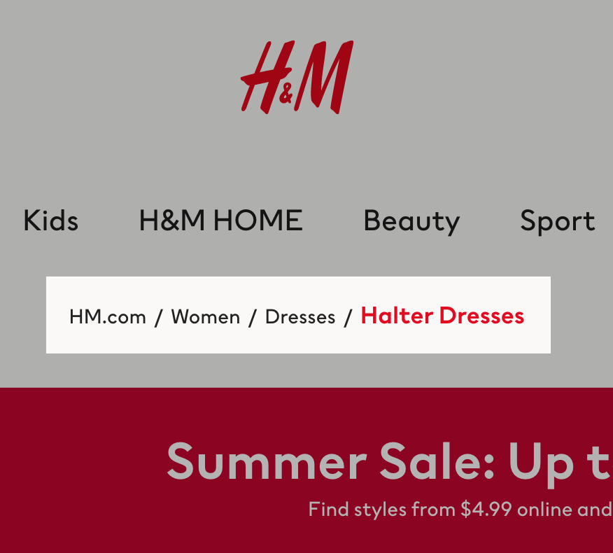
Such features demonstrate excellent information architecture and item labeling.
The result? Shoppers can quickly choose from thousands of products without getting lost. Or overwhelmed.
9. Zoom: Video Calling Made Easy
Zoom makes video calling easy for all users, including those with disabilities or limited technical know-how. Some notable features in this area include:
- Caption translations
- Screen reader support
- Keyboard navigation
- Dark mode
Its interface simplifies virtual meetings through the use of navigation buttons and icons. Once logged in, you’ll see three options on the right side on the screen:
- Host a meeting
- Schedule a new meeting
- Join a meeting
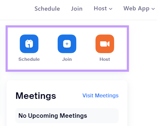
Thanks to this feature, you don't have to browse the entire website or app to figure out how to get started.
You can also switch to focus mode to reduce distractions during video calls.

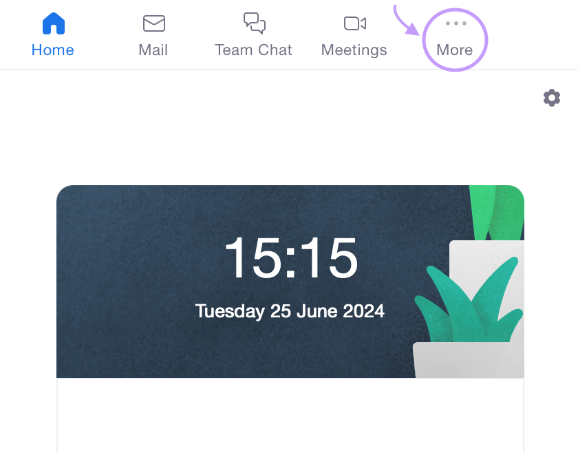
For a personalized experience, customize the toolbar within the app by clicking “More:”
10. Tesla: Minimalism & Functionality
Tesla catches the eye with its website’s minimalist aesthetics and clean lines.
Below are some features that set the brand apart in terms of UX:
- The homepage has minimal text, shifting the emphasis to the product
- The clear and prominent call to action (CTA) buttons show users what action to take next
- The interactive quiz helps prospects choose a car model that meets their needs
- Some product pages have autoplay features for a more engaging user experience
The homepage features the company's latest product releases along with two CTA buttons:
- Order Now
- Demo Drive

The main navigation menu is just as simple, offering quick access to desired information.
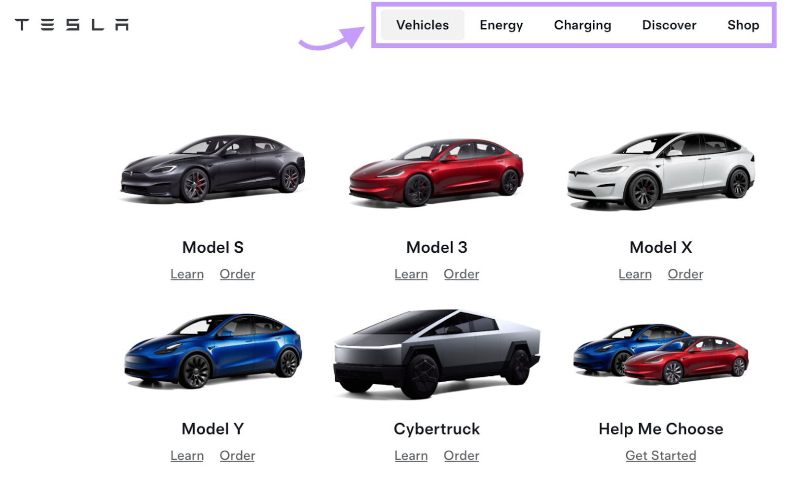
Tesla's product pages feature realistic images, videos, and smooth-scrolling slides. These visual elements have a futuristic feel, reflecting the brand's focus on innovation.
11. Duolingo: Strong Visual Design & High Interactivity
The Duolingo website's playful interface aligns with the brand's message: Learning a language can be fun. What makes it stand out is the use of animations.
Other UX features to take note of include:
- Automatic translation of its web pages based on the user’s location
- Seamless signup process
- Gamification elements
- Instant feedback
- Adaptive learning system
Once logged in, you have access to a visual learning platform with interactive elements.
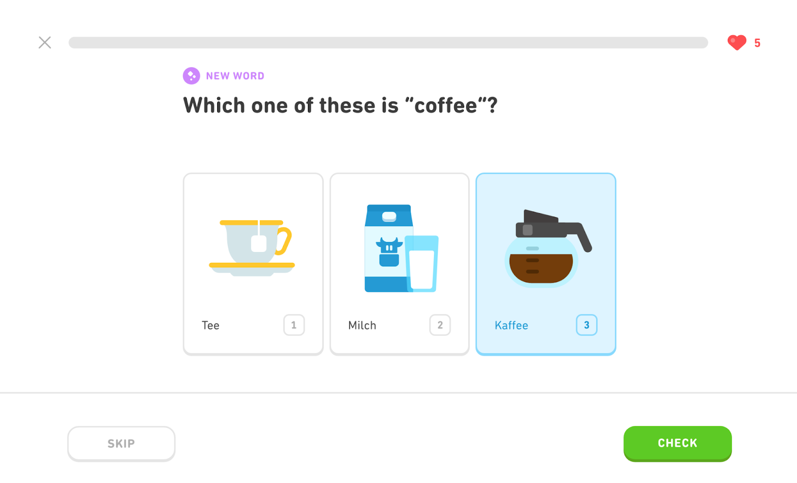
Plus, you receive instant feedback and can track your progress in real time.
The platform also leverages gamification to drive engagement.
For instance, learners can compete for a spot on the leaderboard. Plus, they can participate in daily quests to earn rewards.
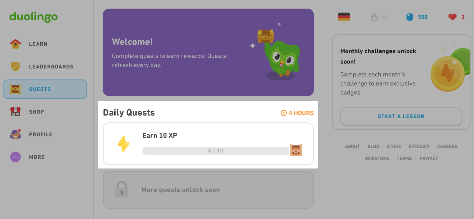
This level of interactivity simplifies learning a language, reduces cognitive load, and enhances the user experience.
12. Dropbox: Simplicity & Ease of Use
The Dropbox website's interface looks basic at first glance. For example, the homepage has only a few images and isn't visually impressive. But its simplicity contributes to its appeal.
Apart from that, the company’s website offers the following:
- Visual icons for uploading files, creating folders, editing PDF files, and more
- A prominent search bar that allows you to easily find the files you need
- Integration with other apps for super functionality
- Easy-to-navigate menus
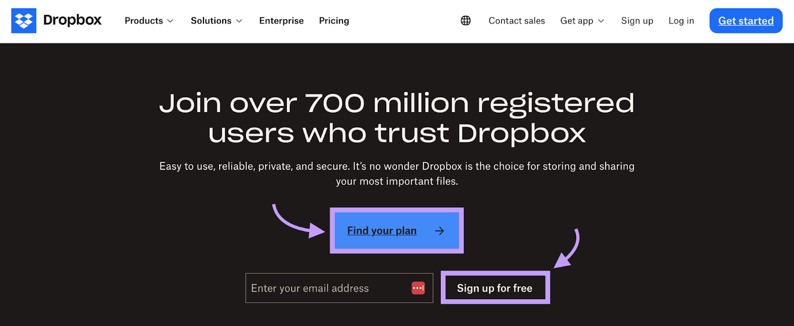
On the homepage, you’ll see social proof: "Join over 700 million registered users who trust Dropbox." Next, there's a clickable CTA button to find a plan.
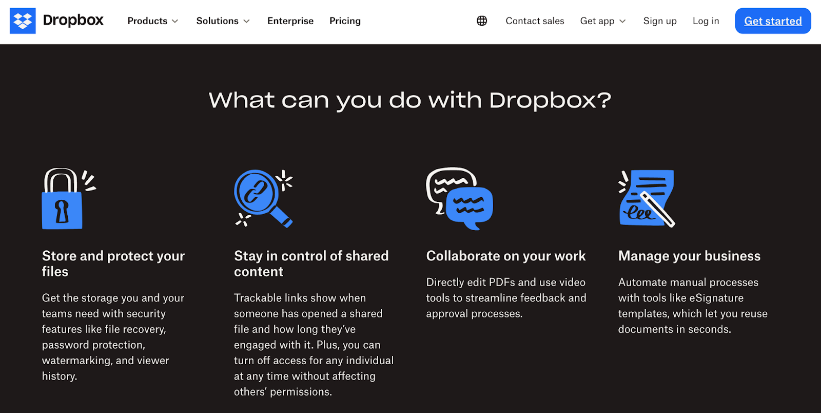
The rest of the homepage shows the app's features without overloading users with unnecessary details.
The Dropbox dashboard is as intuitive and easy to navigate as the rest of the website.
There's a main navigation menu on the left. There’s also a search bar at the top and visual icons for uploading files, editing documents, and other tasks.
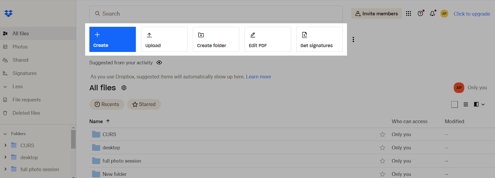
Every element has a purpose, guiding users to complete their desired tasks.
Plus, you can effortlessly apply search filters, zoom in and out of your photos, and bookmark files.
13. Headspace: Accessibility at Every Touchpoint
Headspace meets all the criteria for great UX design: easy navigation, good readability, high-contrast colors, and accessibility features—just to name a few.
Some of its key features include:
- Descriptive categories, like “Meditation,” “Sleep,” and “Mental Health”
- Instant feedback after each meditation and throughout the user journey
- Advanced filters (e.g., sort meditations by length, purpose, or skill level)
- Customer reviews, ratings, and other social proof
- Large CTA buttons
- Large, readable fonts
- Visually appealing layout
The information on its homepage is organized into easy-to-navigate categories based on users' interests.
If you want to learn more about mental health, click that section in the navigation bar to see the available resources. From here, you can access a digital library, listen to podcasts, or read expert tips.

Each page has clear CTA buttons that tell you what to do next. The same goes for the user interface, which guides users through the different types of meditation, breathwork, and mindfulness techniques.
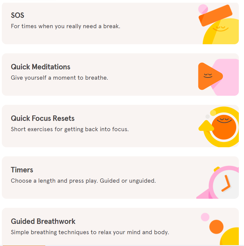
Similar to Duolingo, Headspace leverages gamification to engage users. Its interactive features personalize your experience while adding a fun element.
Further reading: 30 Attention-Grabbing Call to Action Examples
14. Calm: Color Choices That Reinforce the Brand’s Mission
Calm leverages color psychology to instill a feeling of tranquility and draw the user in. For instance, the dominant color—blue—evokes calmness and serenity.
Its site is one of the best UX design examples in the mental health space, blending aesthetics and functionality. We were particularly impressed with the following elements:
- The minimalist navigation menu
- Readable fonts
- High-contrast colors
- Seamless registration
- Descriptive images for each type of meditation
- Consistent color palette
Calm's website also features clear CTA buttons that guide you toward the desired action.
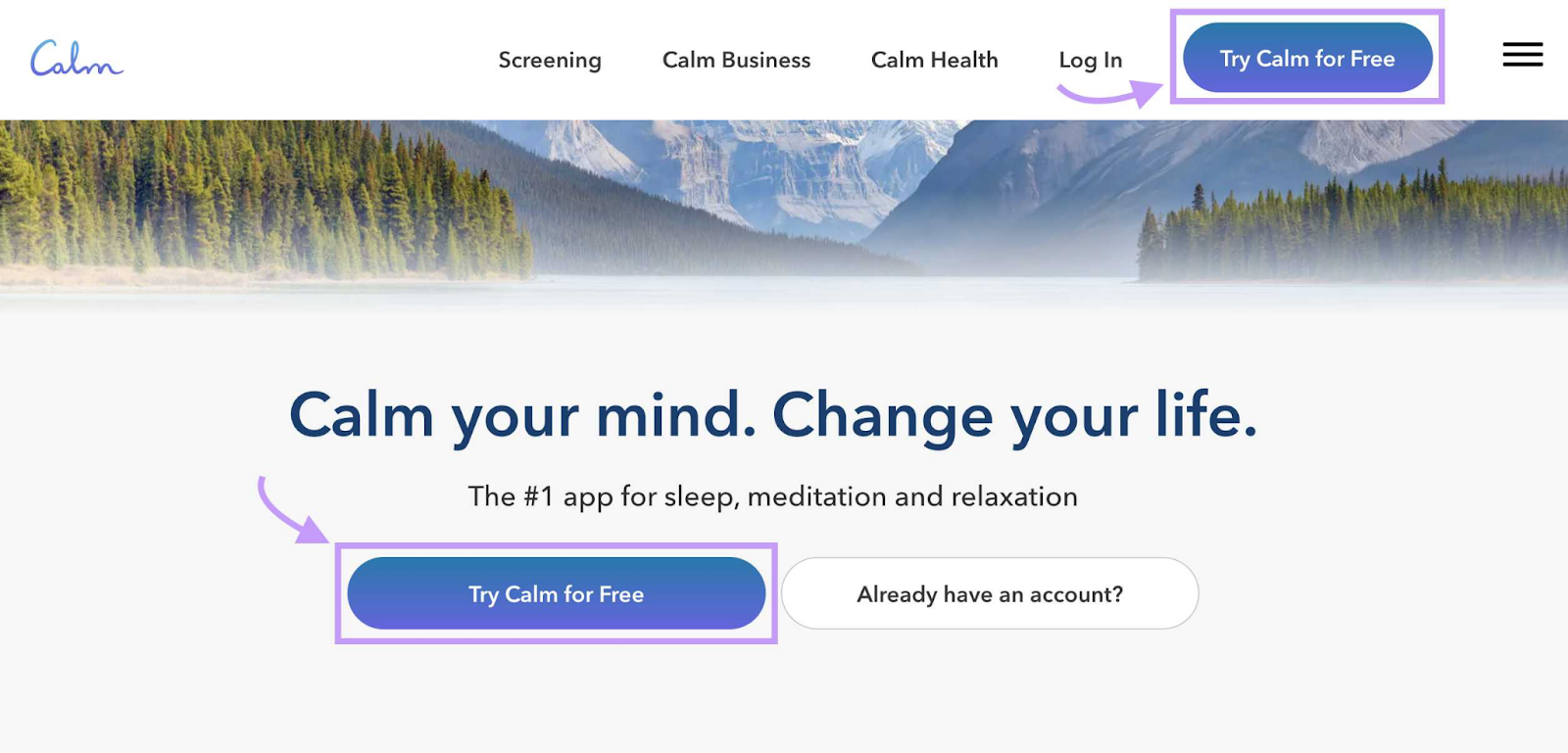
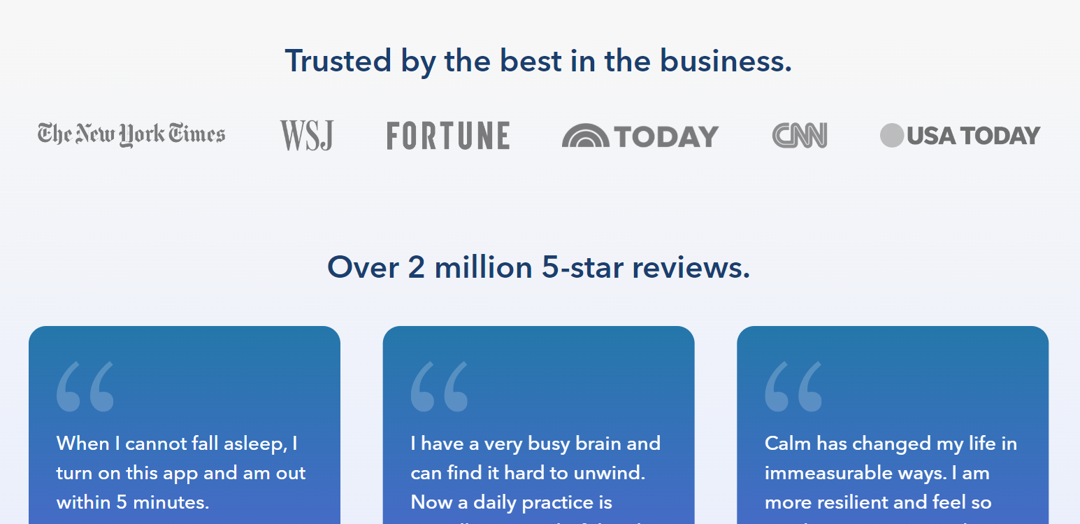
Plus, it displays social proof to establish credibility.
For example, the homepage has a section called "Trusted by the best in the business." Here you can see the publications that recommended or reviewed the app.
Elevate Your UX Design for Better Engagement
Some of the best UX design examples come from top brands. However, this doesn't mean you can't achieve similar results with a small team.
First, check your website's health with the Site Audit tool to find areas for improvement. You'll also want to try Semrush’s Website Testing app to see how your site looks and behaves on different platforms.
Next, implement the Web Content Accessibility Guidelines. This step alone can improve your website's functionality and reach.
Lastly, continue to review and refine your UX design. This process requires ongoing work, as customer needs are constantly changing. And so does the world of UX, which is evolving with the latest technology.
[This post was updated in 2024. Excerpts from the original article by Andrew Chornyy may remain.]
