By the end of 2023, there were more than 6,100 digital marketing agencies operating in the United States — and that number keeps growing. With so many agencies offering similar digital marketing services to their clients, developing an agency website that stands out from your competitors is as important as ever.
Fortunately, we have a list of five marketing agency websites that can help you start building your own site from scratch or help influence you to make updates to your existing website to help capture more qualified traffic. Read on to get all of the inspiration you’ll need for your site.
1. Ignite Agency
Ignite Agency describes itself as a global creative agency that focuses on digital crowdfunding marketing and promotion. Its clientele includes inventors, entrepreneurs, and enterprise businesses. It provides PR, web, mobile, video, and branding services.
The Good
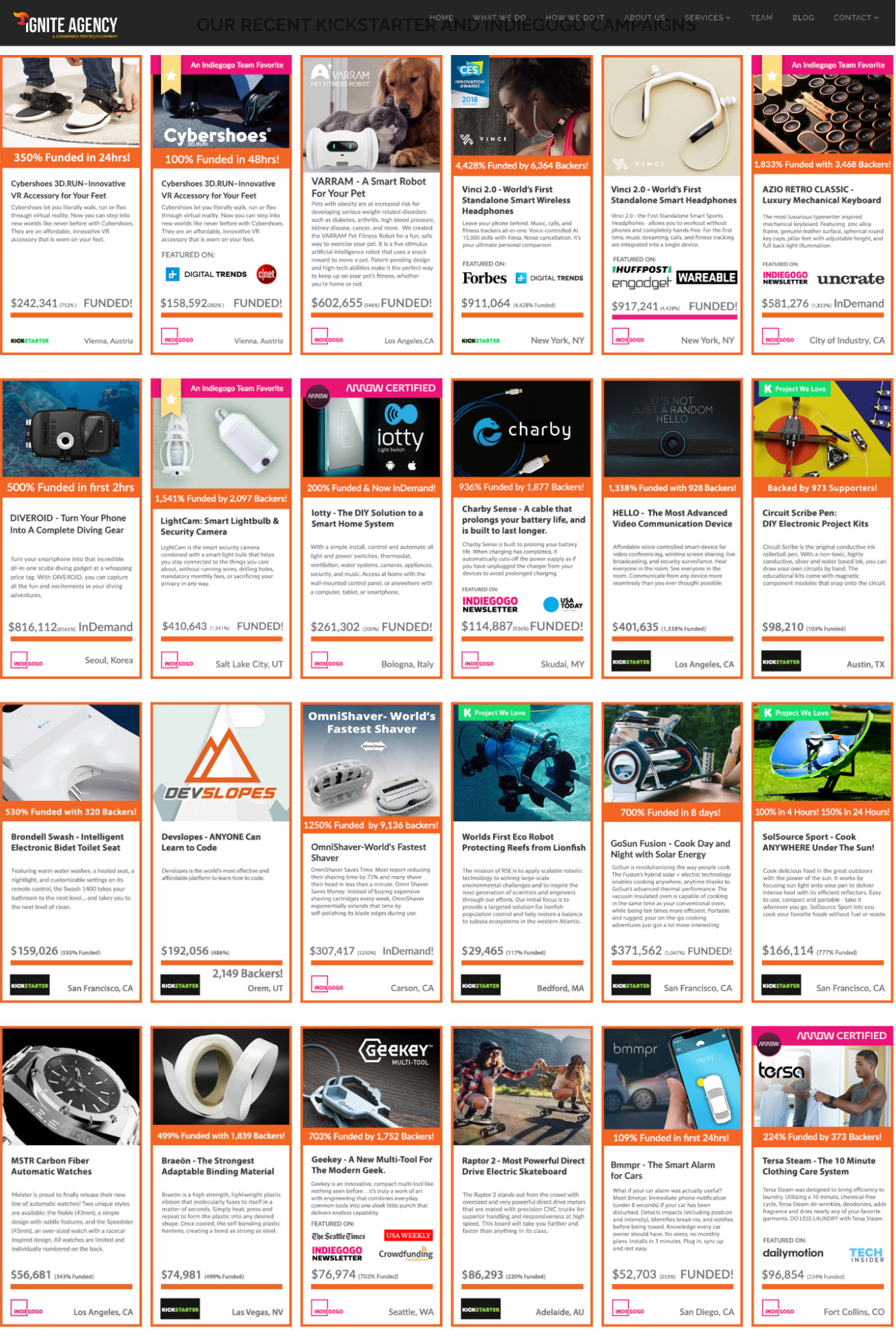
- Ignite’s website successfully targets prospective clients who are looking to crowdfund an invention or product. The site’s homepage highlights dozens of successful crowdfunding campaigns. Showcasing the many kinds of businesses and products that Ignite has worked with allows prospects to imagine their own successful crowdfunding campaign.
- Ignite’s suite of client success stories is clickable, and each example links to the original campaign. This is also great advertising for its clients! Someone checking Ignite’s site for their own business needs might see an existing client that they would like to collaborate with or purchase products from.
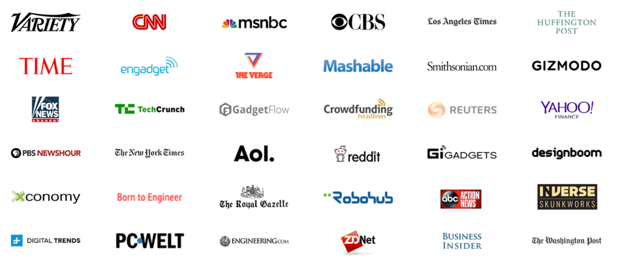
- Ignite has a large suite of impressive client logos at the center of its homepage, so prospects don’t have to scroll too far to see who Ignite works with. Eye-catching names like Variety, CNN, and Time imply that Ignite not only has authority in the industry, but it also has worked with high-profile clients with large portfolios.
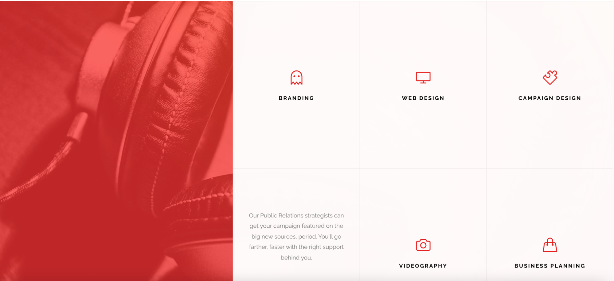
- Ignite has an interactive menu for each type of service it offers. Hovering over each icon gives the reader a brief description of what that particular service offering is. Then, users can simply click the “Get Started” button to move on to the next step of the process. This section is fantastic for prospective clients who are closer to the bottom of the purchase funnel.
Takeaways for Your Agency Website
- Whether you’re working with clients big or small, engendering trust is an essential part of the process. Transparency about who you work with can help prospective clients imagine success with your agency. Highlighting accomplishments and testimonials can only further convince prospective clients that you are a safe and successful agency.
- While flash elements and other highly technical website features can be great eye-catchers, nothing beats the simplicity of a great logo suite. Logos are a signal to clients that you’ve worked with companies like them (or companies that they aspire to be like). Consider using logos as a very simple resume for your agency.
- Don’t be afraid to target the bottom of the funnel on your homepage. Ignite made it easy for clients to contact them directly, should they be in the position of moving to the first steps of the contracting process.
2. Rocket Clicks
Rocket Clicks is an agency based in Milwaukee, Wisconsin, focusing on providing clients with pay-per-click (PPC) advertising expertise and search engine optimization (SEO).
The Good
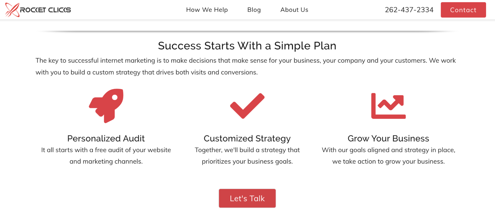
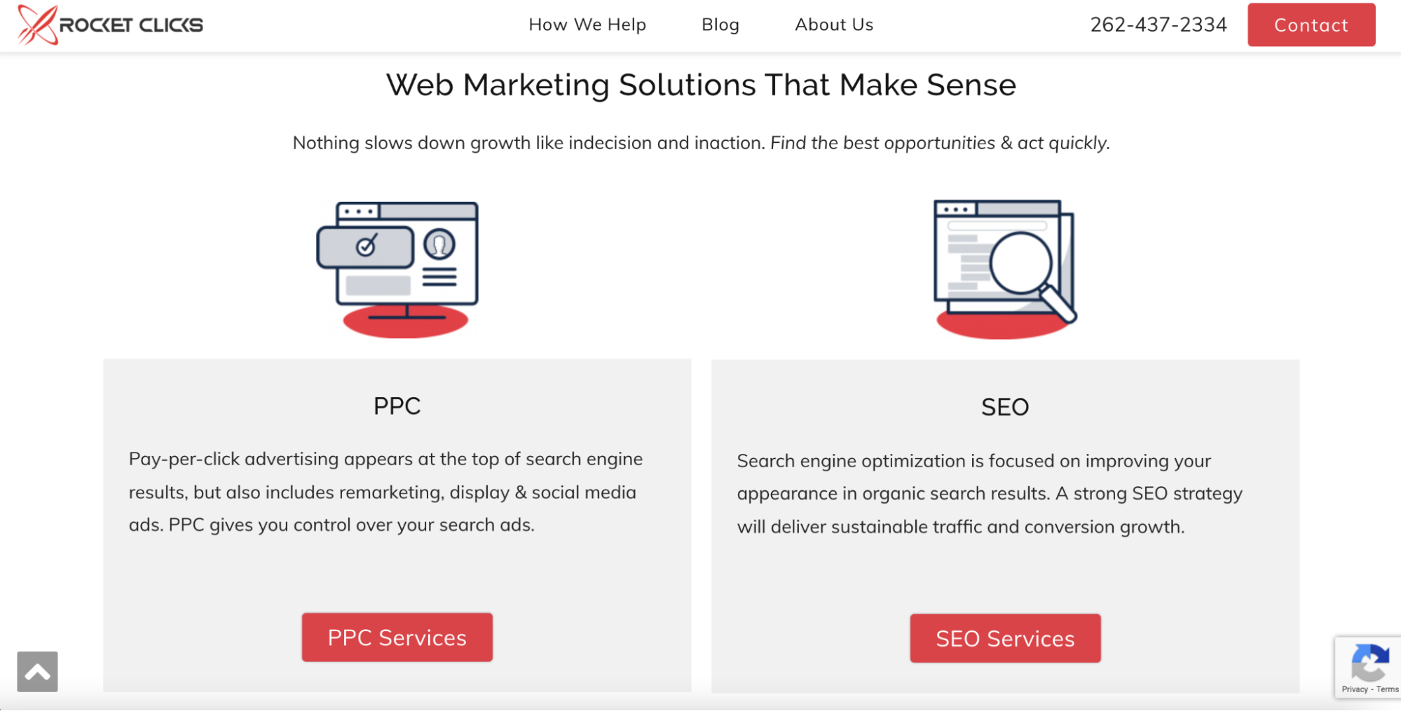
- Rocket’s website is short and simple to navigate. Its homepage focuses on making communication with the agency a breeze. The first page has multiple CTA (call to action) buttons (though none are overly intrusive), and they quickly get down to describing what it means to partner with the agency for PPC and SEO services.
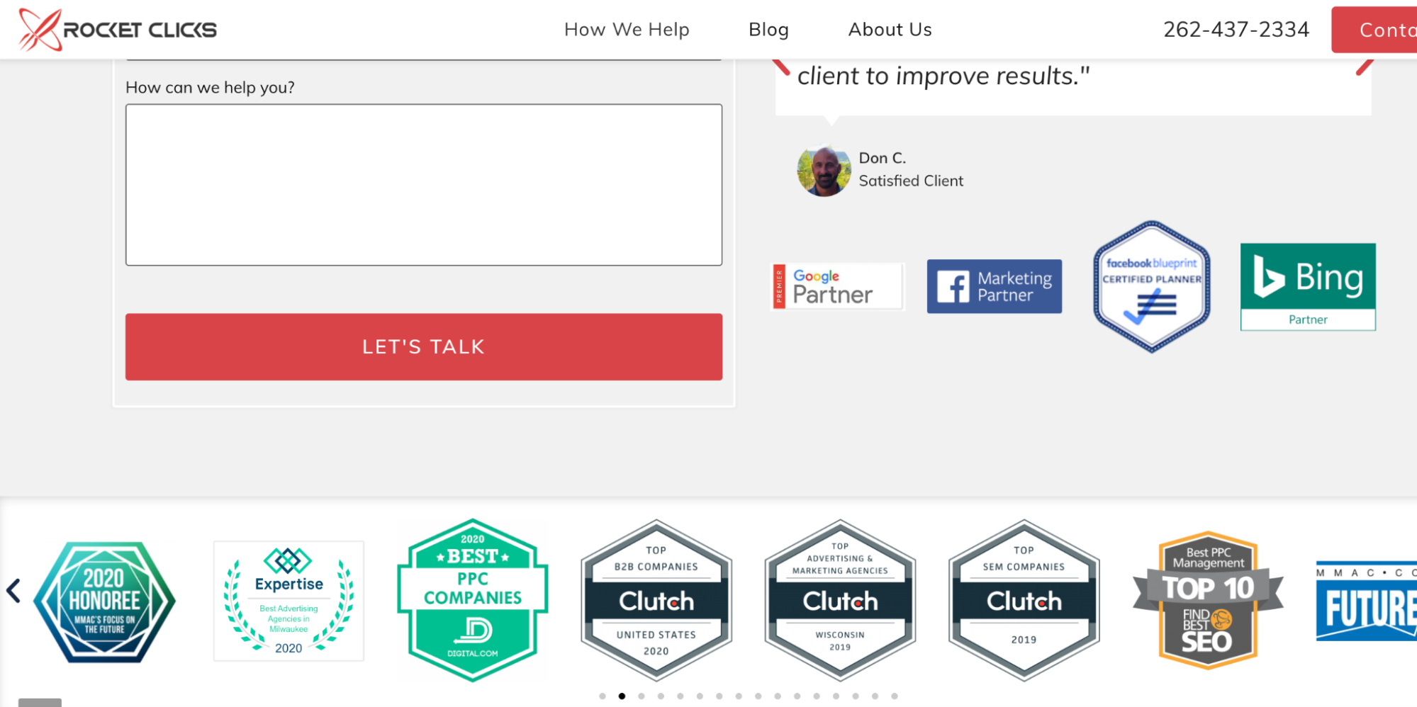
- Rocket Clicks has a suite of award icons at the bottom of its (short) homepage. Right away, visitors can see that Rocket Clicks has been acknowledged for its accomplishments and great work with clients.
- The agency uses space sparingly on the homepage — it isn’t bogged down with heavily coded elements or flashy visuals. This puts the focus on its services, first and foremost. Prospects can easily select between PPC or SEO work to get more information on exactly what their business needs.
Takeaways for Your Agency Website
- Simple is better than clunky! Some agencies make the mistake of sacrificing user experience for flashy visuals. Rocket Clicks is a great example of using your homepage real estate wisely. Less frills might mean a less thrilling experience, but if clients can easily find how to contact you, that makes their lives (and yours) that much easier.
- Highlight your accomplishments somewhere noticeable. This signals to clients that external, third parties have validated your work — not just former clients.
- Short, punchy descriptions of your services upfront can draw in those prospects who are very eager to begin working with your agency.
3. Neon Ambition
Neon Ambition is a digital agency that offers a number of services ranging from SEO to OTT video (streaming) ads. The company boasts an impressive roster of employees including a 17-year SEO veteran and several former Google employees.
The Good
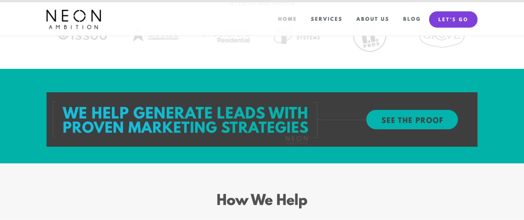
- The agency uses the catchphrase “See the Proof” across its site. It’s a catchy and magnetizing tool for reeling in prospective clients. Businesses often have tight marketing budgets, and they will want to know that Neon Ambition has generated results for its clients.
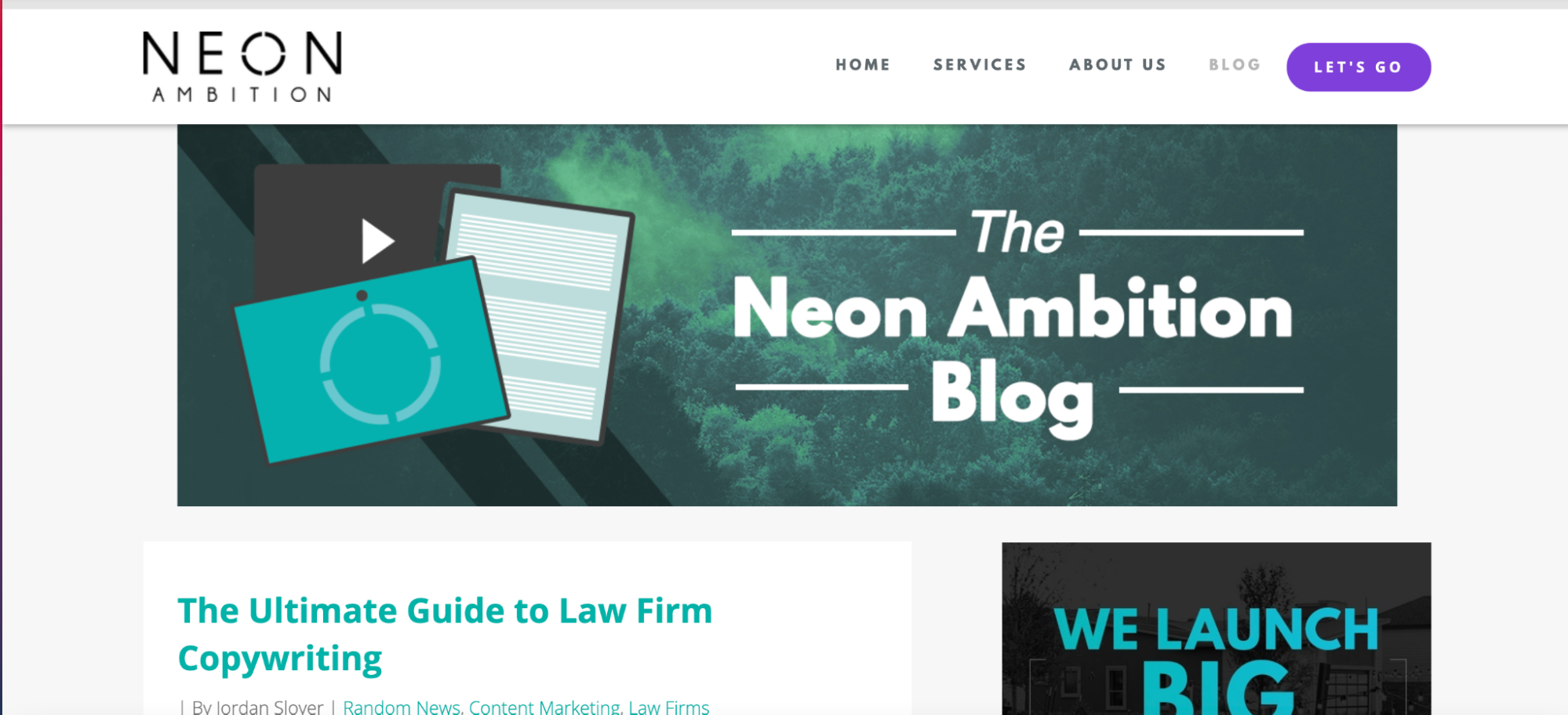
- The agency utilizes a blog to highlight its accomplishments, business news, and case studies. Its long form content acts as both a resume and a resource hub for prospects that want more information on Neon’s business model.
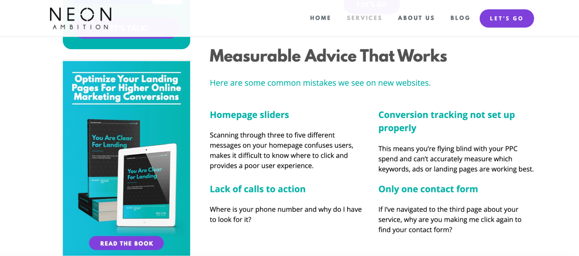
- Neon Ambition offers a small, yet interesting section at the bottom of its services page that gives some free advice to prospective clients. It lists out common mistakes they see with existing client sites. If a prospective client sees that they too are making similar mistakes with their website, they might be more inclined to work with Neon Ambition. This also signals trust and transparency on the part of the agency.
Takeaways for Your Agency Website
- Unique, catchy, and engaging CTAs are more likely to draw in prospective clients. Don’t underestimate the power of a well-placed and well-worded CTA.
- Consider building an SEO-targeted blog. This is especially important if your agency offers SEO services. A blog that displays stellar on-page SEO will act like a business showcase for your agency. You can also use this space to share business news and service updates.
- Don’t be afraid to show your cards a little. Neon Ambition offers anyone who comes to its site some free advice on how to run a successful digital brand. It gives away just enough information to signal to clients that the agency is trustworthy and authoritative without giving them the entire blueprint to solving business problems themselves.
4. Web FX
Web FX is a tech-driven digital marketing solutions company, boasting over $700 million in sales for their customers. They offer proprietary tools that track results for their clients with services ranging from SEO and lead generation to UX (user experience) and interactive website design.
The Good
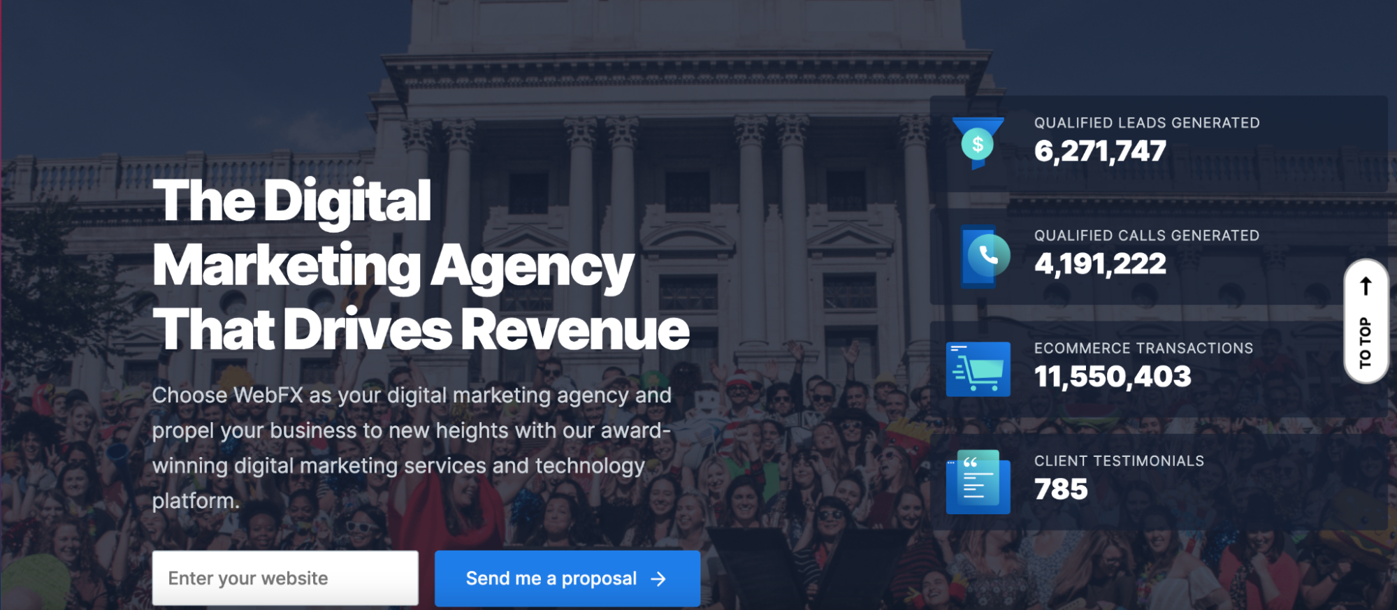
- Web FX does an incredible job showcasing its results for potential clients. On its homepage is a ticker bar featuring some of its successes. It’s easy to read, and the numbers are really impressive.
- The agency offers a content library and a section called “Fix Your Funnel,” which offers some colorful illustrations on the sales funnel and common mistakes Web FX’s clients make when trying to optimize for conversions.

- Great website architecture isn’t just a good thing to have, it’s a must. Web FX has a very clean but thorough navigation structure that makes it simple for prospective clients to flow through the site and find what they are looking for, even with so much information offered.

Takeaways for Your Agency Website
- It’s OK to brag about your accomplishments, upfront! Make your metrics easy to digest and find for prospective clients. They may be more likely to work with you the more impressive your numbers are, so choose your metrics wisely.
- Consider building a content library or resource hub for your site where prospective clients can learn more about your industry and the importance of great digital marketing.
- Always, always, always put the user experience first. Your site, especially if it is information heavy, should be easy to navigate.
5. SmartSites
SmartSites is a digital agency that boasts over 900 client websites launched and $100 million in revenue for its customers. The agency specializes in web design, PPC, and SEO services.
The Good
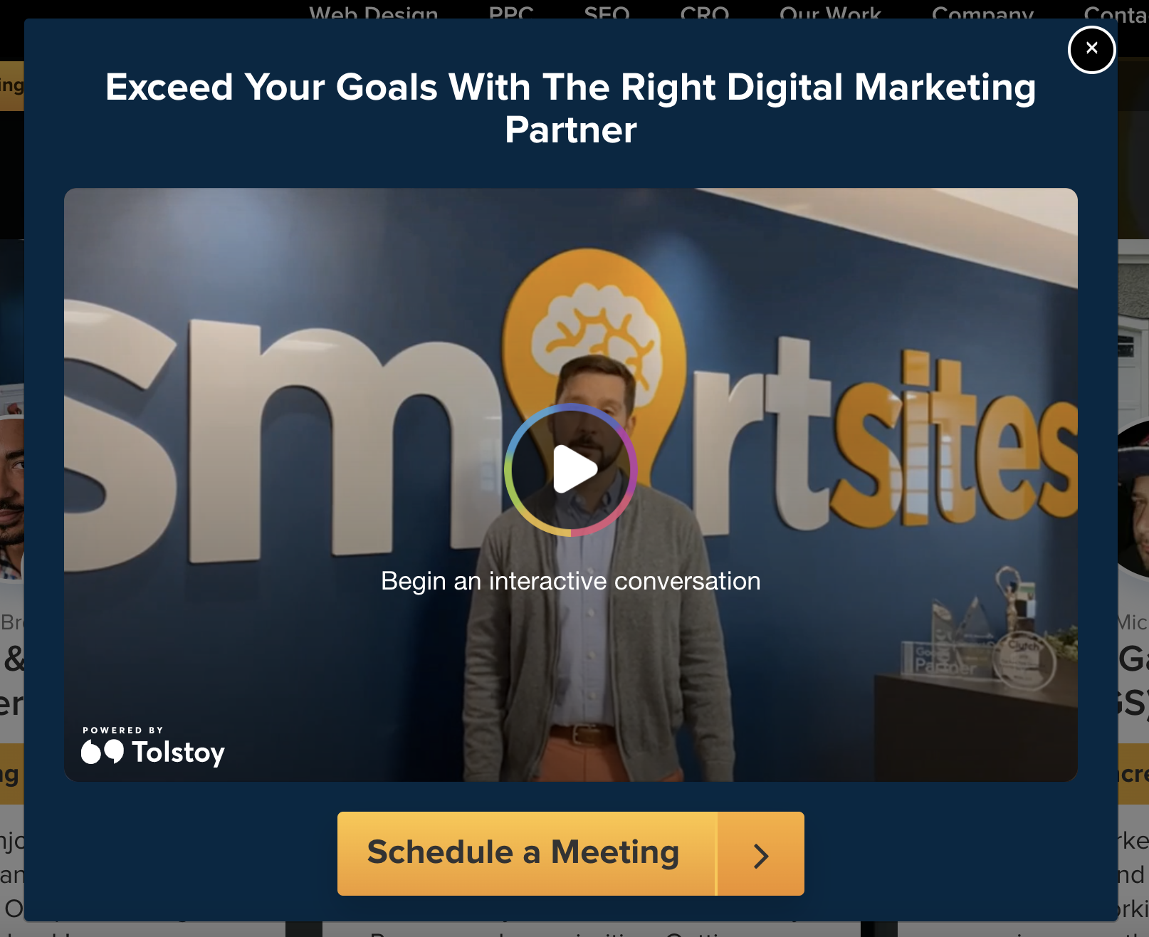
- An agency that offers web design services can’t fall short on its own site. SmartSites’ homepage does a great job showcasing interactive and accessible website content. A pop-up video appears with the message “Begin an interactive conversation.” This is great for visitors who don’t have time to read through comprehensive written content.
- The agency offers a chat feature that makes it easy for prospective customers to ask questions and get quick answers. Providing rapid contact can help capture leads earlier in the funnel and adds a personalized touch.
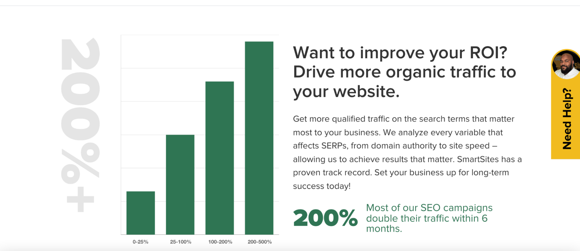
- This digital agency website also includes some data and graphs that showcase realistic timelines for results. In the digital marketing industry, many clients want to know when they will see results for their business, and some clients who don’t have much experience aren’t aware that results, especially organic SEO, can take a lot of time and effort. Web FX shows potential clients, off the bat, that real results take time.
Takeaways for Your Agency Website
- Offering accessible and dynamic content captures leads that would have otherwise been turned off by clunky, large chunks of text. Videos, images, and infographics can provide quick snapshots of your client successes. Generally speaking, customers are up to 85% more likely to purchase a product after watching a video about it.
- Give prospects the tools they need to contact you quickly. Offer an email submission form on the homepage, a chat feature, or a call-back feature that takes the burden off of the client to chase you down for simple questions or information.
- Set realistic expectations throughout your content. Offer data and statistics where appropriate. Entice visitors with graphs that showcase steady improvements over time.
Digital Agency Websites: Aim to Be Among the Best
These five agency websites showcase some incredible ways to capture new audiences while offering some great inspiration for those looking to make their site one of the best digital marketing agency websites.
One common theme among these top performers is outstanding SEO-focused, long-form content about their service offerings and unique touches that make their agency stand out from thousands of competitors.
If you want to make this the best year yet for your agency, but aren’t sure where to start, check out our Agency Growth Kit. 30% of Fortune 500 businesses are now using Semrush’s tools to help them better engage with their audiences. With the Agency Growth Kit, you get access to the inbound lead platform, white-label reporting, and customizable client portals.
Whether you’re building a new site or updating your existing one, remember that the best digital agency websites offer prospects an experience that feels customized to the problems they are trying to solve. Keep their experience top of mind as you develop your site. Outstanding web content will speak to them and capture them right at the moment they need you.
