What Is a Google Analytics Dashboard?
A Google Analytics Dashboard is a custom collection of data that offers a comprehensive view of a website's performance, user interactions, and other metrics and events.
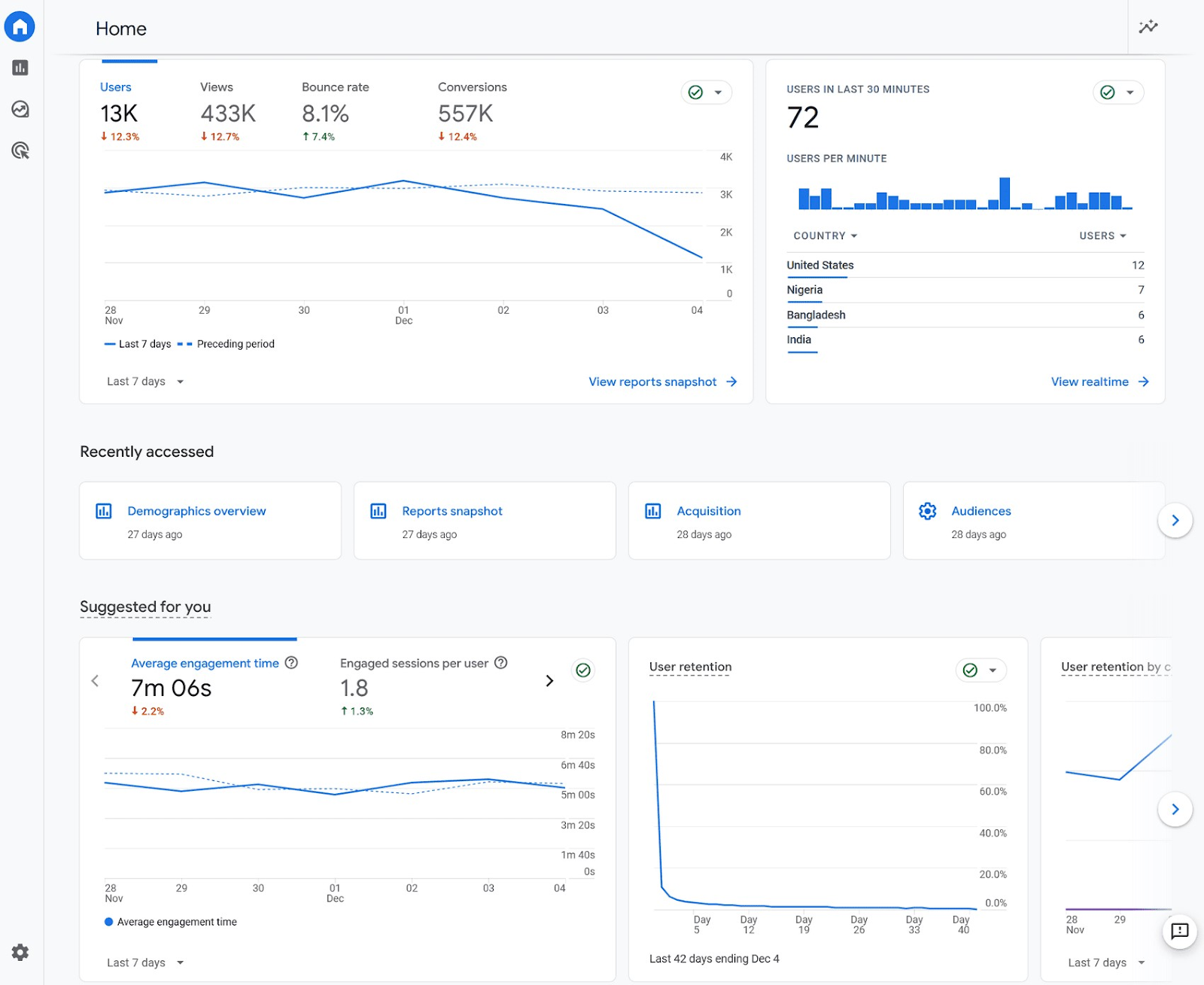
This is what a Google Analytics Dashboard can look like:

Creating custom Dashboards in the now-retired Universal Analytics was easy. You could simply import a template from the Google Analytics Solutions Gallery.
But Google Analytics 4 is a bit more challenging.
Which is why we created this guide to show you how to set up your custom reports and track the data that’s most important to your brand.

Why Are Google Analytics Dashboards Important?
Google Analytics Dashboards present data in an easily digestible format you can share with other teams without them needing to be Google Analytics experts to pull the information
In addition to ease of sharing, Google Analytics Dashboards have the following benefits:
- Streamlined data analysis: In other words, you don’t need to pull the same report day after day, week after week. You create it once and monitor from then on.
- Customization: Users can zoom in on the data that truly matters to them. Instead of relying only on the out-of-the-box reports Google Analytics offers.
- Real-time insights: With features such as real-time visitor counters, Google Analytics Dashboards provide immediate access to key performance indicators.
Data dashboards, in general, are effective at rallying various teams around shared goals and a shared understanding of progress toward those goals. They’re as much an organizational tool as they are an operational or analytical tool.
How to Create a Custom Google Analytics 4 Dashboard
Google Analytics 4 is a customizable events-based tracking platform. Which means that if you want more specific analytics, Google Dashboards can be set up to track those data points.
You can set up a Google Analytics custom Dashboard for many purposes, but we’ll walk through a specific Google analytics SEO Dashboard here.
Here’s how to set up your custom report.
1. Go to the Reports Dashboard
Logging into GA4, you’ll see a Dashboard with default information:

To build custom Google Analytics 4 reports, hover over the left-hand menu and click on “Reports.”

You’ll see another default Dashboard (the Reports snapshot), and several other default reports based on the goals you chose during setup. Like the “User acquisition” or “Generate leads” report.

2. Choose Relevant Cards
Cards are charts, bar graphs, and other visualizations that present data you want to track.
Your Google Analytics 4 Dashboards are made up of multiple cards.

To create your custom report, click on one of the pre-made dashboards available in your reports tab.
In this case, we chose “Acquisition” > “Overview.”

Then, click on the pen button in the upper right corner of the dashboard.

A sidebar will appear with all the cards currently on your dashboard.

From there, you can remove irrelevant cards by clicking on the “x” button beside each metric. And add cards by clicking on the “+ Add Cards” button.

When adding cards, make sure to go through both the “Summary Cards” and “Other Cards” tabs to find the perfect metrics for your dashboard.

For example, if we want to know if people are reading our blog posts, then we might select the “Other Cards” > “Average engagement time, +2.”

Doing so would add the card to our existing dashboard. And show us how long users spend on the site, in a glance.

3. Customize Your Cards
Most of the cards in Google Analytics 4 have drop-down menus you can use to define what metrics and dimensions you want to track.

Further customize your Dashboard using that drop-down menu.
And voila! You have your custom GA4 report.
Bonus: Create an Exploration
You can also use the “explore” tab to create data visualizations and custom analyses, which can be included in dashboards. The three default options are free form, funnel exploration, and path exploration.
You can also start “blank” or use the templates gallery:

While each of these explorations can be useful for creating custom dashboards, the free form and funnel exploration tools are particularly useful as a complement to default reports.
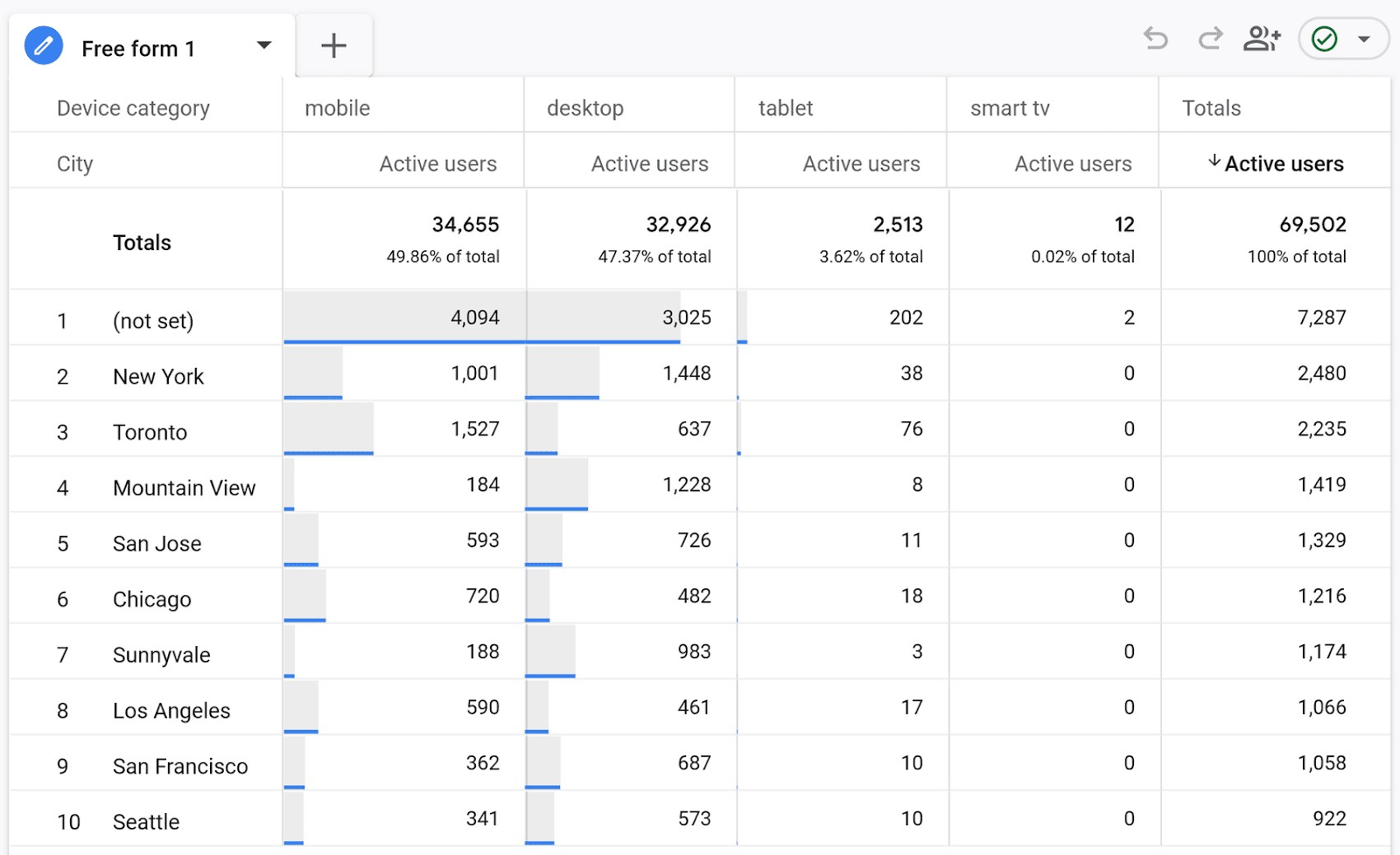
If, for example, we wanted to see event counts by session medium, we can use the free form exploration tool to visualize this:

As you can see, GA4 is nothing but custom dashboards, eliminating the idea of a separate UI to build custom dashboards. It’s all custom in the new world of Google Analytics.
At the end of the day, Google Analytics dashboards are endlessly customizable. Which is why it’s important to start with key business questions and only then proceed into dashboard creation.
5 Best Practices for Dashboard Configuration and Visualization
To create the best Google Analytics Dashboards, it helps to follow certain data visualization best practices.
The most important thing is to understand your audience and the actions you want to drive. This will set the foundation for what information you display and how you display it.
Keep these five best practices in mind as you build your Google Analytics Dashboards:
1. Answer the Right Business Question
Since you can create a Google Analytics dashboard for pretty much anything, an important first step is to determine which business question you’re hoping to answer with the dashboard.
The target audience for your dashboard also matters.
For example, if you’re presenting reports to a client or stakeholders, you may need to slice the data differently than if you were simply creating the dashboard for your own analysis purposes.
Try to state clearly the purpose of the dashboard. For example, “we will use this dashboard to track organic performance over time and report on progress toward our quarterly goals.” Or, “we will use this dashboard to monitor and identify potential broken pages on our site.”
2. Choose the Right Metrics and KPIs
Align your KPIs (key performance indicators) with the business objectives. Avoid displaying unnecessary data, and focus on what drives decisions.
Many people try to squeeze as much data in as possible, but simplicity is key with dashboards. Consider the presenter’s paradox and opt for less information, but focus only on critical information.
More is not better. In SEO reporting, map your visualizations back to what people care about, which is usually traffic and revenue growth, and then give the option to drill down by page or other dimensions.
Metric time series charts, bar charts split out by a dimension like source or landing page, and a table to dive into the details presents viewers with easily accessible information from which they can dive further into analysis.

Typical KPIs to include in organic performance dashboards include leading indicators like search impressions and clicks, as well as sessions or page views by URL. They should also include business metrics like leads, purchases, or revenue split by channel and page.
Avoid including too many segments and filters in your dashboards, as they will often obfuscate learnings.
Instead, use dashboards as a progress indicator. And use segments and filters to drill down and conduct analysis based on higher level performance.
3. Set Up Events to Track Site Activity
To get the most out of Google Analytics dashboards, you first have to set up events that correspond to meaningful interactions on your website.
Out of the box, you’ll be able to report on rich data like traffic sources, device types, and which pages users visit.
But with a solid event setup, you can track anything. This could be video plays or completions, specific CTA clicks, scroll depth, purchase amount, and more.
This also gives you the ability to set up interesting user path analysis reports to see the order in which users are triggering certain events.
This is a great way to understand user behavior on your site and begin to improve and optimize it.

4. Use Benchmarks to Analyze Data
Use benchmarks, targets, or historical data comparisons to provide context. It helps users understand if the numbers are good or bad and leads to actionable insights.
Data in isolation is difficult to act upon. However, when metrics are compared across time periods, you can quickly determine whether your efforts are paying off or are falling short of your projections.
Benchmarks can be applied within an industry or a set of competitors. Or you can use your own data to create benchmarks. For example, Google Analytics gives you the ability to compare a date range with the same date range last year, giving you an apples-to-apples comparison of the metrics:

5. Ongoing Maintenance and Iteration
A dashboard is not a "set it and forget it" tool. Regularly review it with end users and make necessary adjustments to ensure it stays relevant and valuable.
On a regular interval, review your dashboards and get stakeholder feedback to see how you can improve the utility of your dashboards.
How to Share and Import Analytics Dashboards
Sharing dashboards is very easy with Google Analytics 4.
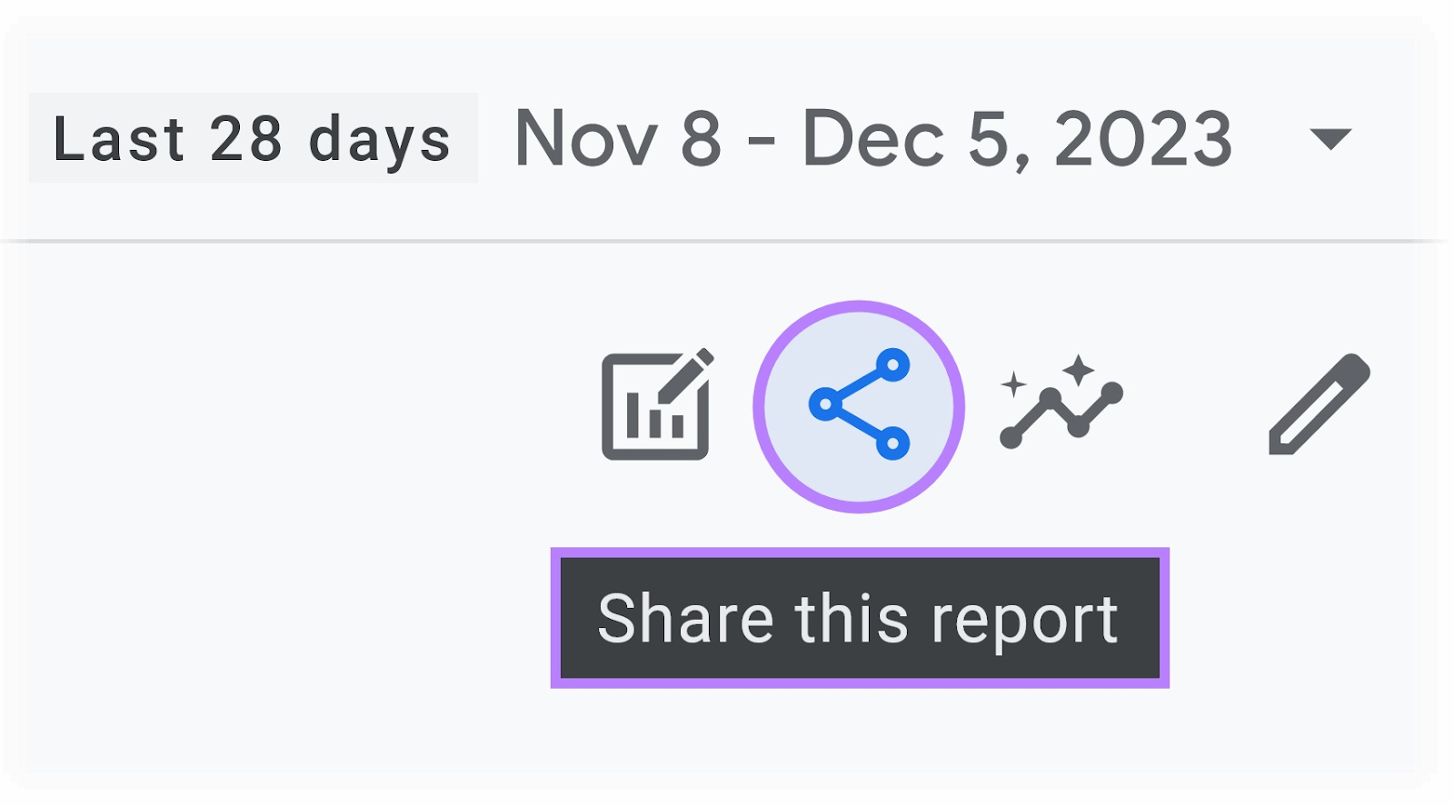
If you’re creating Google Analytics Dashboards directly in the interface, simply look for the “Share this report” icon on the top right menu:

Click this, and you can choose either to share the link directly, or download the file (in either CSV or PDF format) and send it to your peers:

5 Free Google Analytics Dashboard Templates to Consider
While the Solutions Gallery isn’t useful in the GA4 age, there are still plenty of free Google Analytics Dashboard templates to get you started.
These range from GA4 exploration report templates to Looker Studio starter templates.
Here are five great Google Analytics Dashboard examples for digital marketers:
1. Semrush SEO Dashboard
The Semrush Project Dashboard is a beautiful way to marry Google Analytics traffic and conversion insights with Semrush search performance insights.

As a default, the dashboard shows you all of the SEO metrics to quickly diagnose the health of your property, from domain analytics like authority score, traffic, and keywords, to a backlink audit that shows you the toxicity of your link profile.
Clicking into any of the given cards in the dashboard presents you with an impressive deep dive into specific SEO reports.
For example, the Organic Traffic Insights report shows you metrics across Semrush, Google Search Console, and Google Analytics, to give you comprehensive insights by landing page:

It’s a benefit to having all of your key analytics platforms in one place. That alone saves time.
But the real value is in combining and comparing metrics across the different tools, like Google Analytics and Google Search Console, to get a true understanding of your organic search performance.
2. Path Exploration
Path Exploration is a default template within the “Exploration” tab in Google Analytics 4.

Path Exploration answers one of the most common questions: How are people navigating my website?
While page path analysis can sometimes confuse rather than illuminate, it does help marketers figure out user experience bottlenecks as well as the most common page paths on their site.
In conjunction with qualitative research and heatmaps, this can help marketers build better information architecture and content, fix user experience issues, and drive better website performance.
3. Funnel Exploration
Funnel Exploration allows you to set up a sequential funnel of events or pages and see the dropoff at each step.

For example, you can see the dropoff from homepage to product page to add to cart to purchase for an ecommerce website.
This is one of the most useful ways to identify areas of the website to optimize and improve, as you can identify the biggest dropoffs and find solutions to improve the dropoff rate.
Funnel Exploration is a default template within the “Exploration” tab in Google Analytics 4.
4. Conversions Exploration
The Conversions Exploration dashboard lets you analyze and compare different conversion events on your website across custom dimensions like device type or other segments.

This can help you identify which conversion events and offers are resonating best with which audiences. The insights can also inform your approach to creating and optimizing offers.
This dashboard is available as a default template in the “Explorations” section of GA4.
5. Google Organic Search Traffic

The last Google Analytics Dashboard example is a default report available in GA4.
It takes a little bit of effort to find, but it’s worth it for search marketers. Take this route to find the report:
“Reports” > “Acquisition” > “Acquisition Overview” > “Google Organic Search Traffic”
This will give you insights from Google Search Console as well as Google Analytics. In its default state, it shows you a time series and bar chart of Google search impressions by landing page.
However, if you click on any of the other metrics in the report, it will change the charts to reflect that metric.
For example, we can alter the dashboard by clicking on “Organic Google Search Click Through Rate,” and now all of the charts will reflect SEO click through rates:

This dashboard is powerful for SEOs and marketers since it collates a large amount of data you would typically have found in different locations, and it allows you to cut search data in many different ways, including using on-site metrics like engagement rate and conversions.
Enhance Semrush Dashboards with GA Data
In the past, custom dashboards were underutilized and often difficult to set up. Now, custom dashboards are the default way to use Google Analytics 4.
From out-of-the-box reports like Google Organic Search Traffic to custom exploration reports like Funnel Exploration or Path Exploration, you can easily answer business questions in Google Analytics.
Even better, by leveraging Semrush SEO Dashboard and connecting your Google Analytics and Google Search Console accounts, you can get a holistic picture of your search marketing efforts. Try it now for free.
