What Is an FAQ Page?
An FAQ page is a dedicated page on a website that answers frequently asked questions (FAQs) related to the business.
Many businesses have FAQ pages to help site visitors understand their products and services. And solve common problems.
For example, here’s Stella & Chewy’s FAQ page:

It’s an effective FAQ page because it anticipates the audience's needs. It also answers common questions and guides visitors to other relevant site content.
FAQ pages may also include questions and answers about:
- Common industry questions
- Operating hours
- Return policies
- Payment options
- Shipping information
- Contact options
- Jobs
Why You Need an FAQ Page
Here are the benefits of having an FAQ page.
It Increases Site Traffic and Online Visibility
When people search for answers related to your business, your FAQ page can appear in search results. So creating an optimized FAQ page can improve your online presence.
For example, WhatsApp’s FAQ page about disappearing messages is a featured snippet on the Google results page:

FAQ pages are good for SEO as they have the potential to drive significant, relevant organic traffic. By targeting question keywords that potential customers use to learn more about your brand or products.
For example, WhatsApp’s FAQ page gets 650.8K visitors per month, according to Semrush’s Organic Research tool.

Because the page is ranking in the top 10 for several high-volume question keywords, like:
- “How to know if someone blocked you” - 4.4K searches per month
- “How to download whatsapp” - 1.3K searches per month
- “How to delete whatsapp group” - 1.6K searches per month

It Improves the Customer Experience
An FAQ page improves the customer experience. Because it helps users get answers faster. Rather than having to dig deep into your website or reach out to customer service.
More specifically, FAQ pages do the following:
- Give potential customers information to aid their decision-making process
- Make key information readily available, which shows that your business is transparent and values customer satisfaction
When people find answers to their questions, they may forgo contacting support. Which can save your staff time and resources.
It Strengthens Your Authoritativeness
FAQ content establishes authority, giving you an edge over competitors who may not be openly addressing common questions.
For example, Stella & Chewy’s uses their FAQ page to establish that they are dog food experts. By answering questions like, “How do I transition (my dog to new food)?”

Doing this can demonstrate your expertise. Because your answers showcase your knowledge. Which can lead to increased customer trust.
8 Great FAQ Page Examples
Struggling to come up with your own FAQ page?
Here are eight great examples for your inspiration.
1. The IRS
Because the IRS is a government entity, it makes sense that their FAQ page design is less creative.
But they offer a great user experience. If visitors have a specific question or topic, they can use the search bar at the top of the page.

The answer to each question is “hidden” behind a drop-down, so users can skim the page quickly and only click on the questions they want.

2. Amazon Web Services
The Amazon Web Services FAQ page uses a simple, easy-to-navigate design.

If you continue to scroll down, the page includes many links under different categories.
Once you click on a topic, you’ll find an accompanying article with additional questions and answers within that topic.

3. Target
Target’s main domain has a help section to assist users with orders, returns, etc.

However, its corporate domain has more specific FAQ pages targeting different user segments (like “Media” and “Careers”).

The average Target shopper probably isn’t interested in these categories. So it makes sense to separate them.
4. Planet Fitness
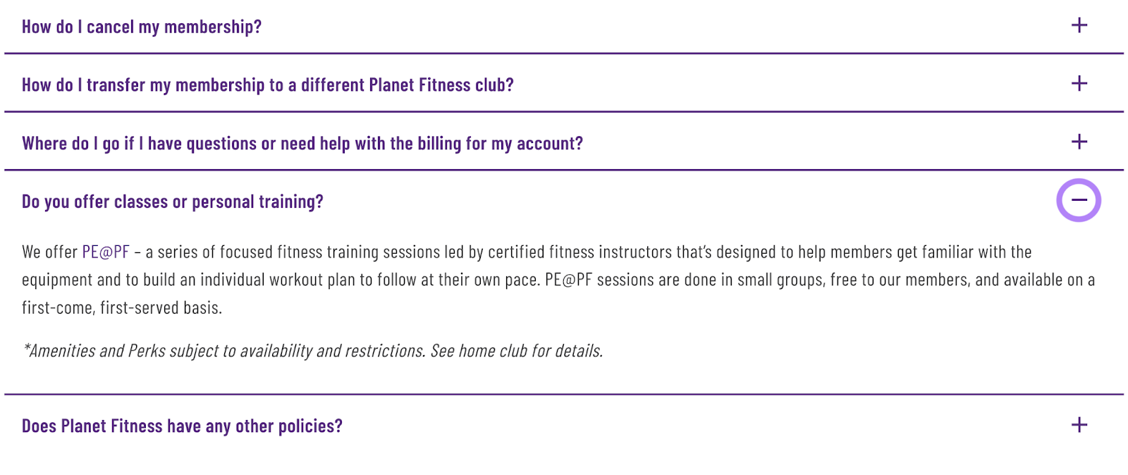
Planet Fitness is a gym chain known for its beginner-friendly simplicity. Its FAQ page follows suit:

Its initial FAQ page has a list of common questions with drop-down-style answers.
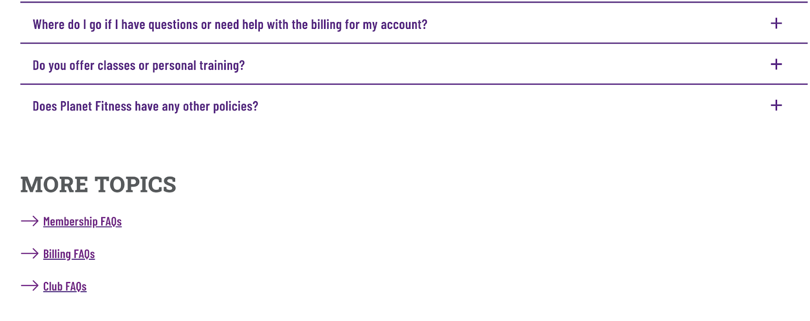
If you scroll further down, you’ll see a section labeled “More Topics.” That directs you to additional FAQs depending on what information you need.
It also includes an option to contact your Planet Fitness club directly.
5. Dunkin’
This famous coffee chain’s FAQ page keeps things simple.
Users can toggle between a few different categories on the top navigation bar. Or navigate directly to their most popular questions:

And once users find what they need, they can click a drop-down to view easy-to-skim related questions:

6. Lily’s Kitchen
Pet food brand Lily’s Kitchen categorizes their questions on the left-hand side of the FAQ page.
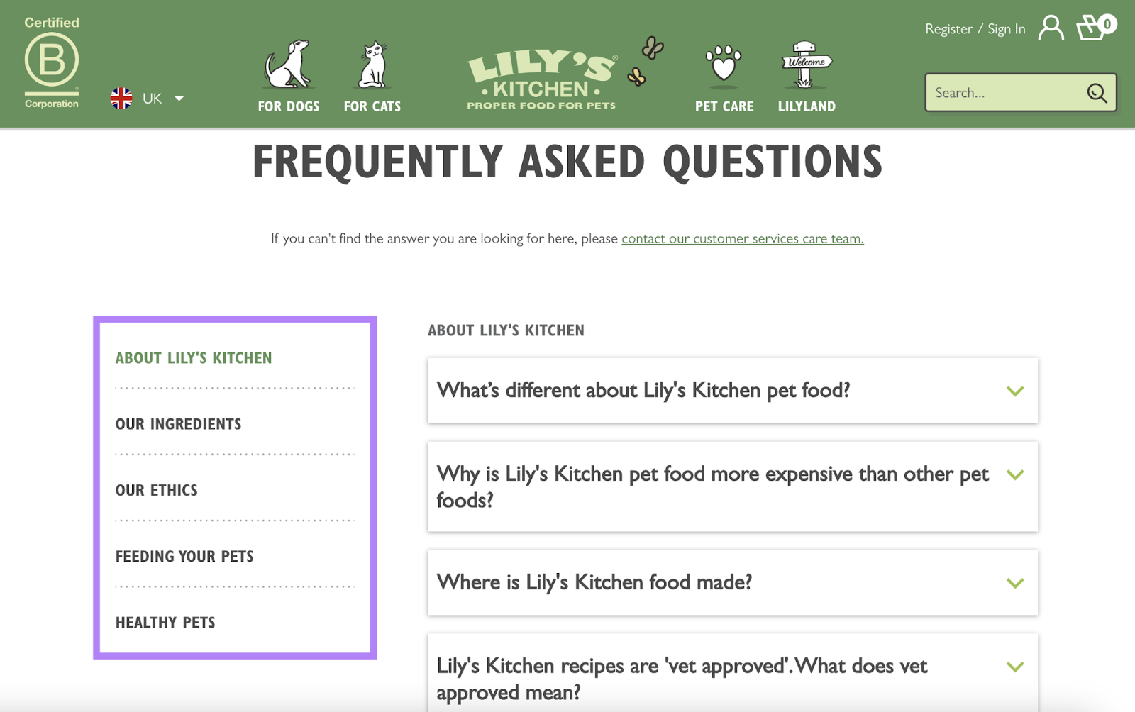
If users can’t find answers, they can contact Lily’s Kitchen’s customer service team using the link under the main heading.

7. Kiehl’s
Skincare brand Kiehl’s also helps visitors find answers through a left-hand navigation menu.
It also has a search bar so people can look for something specific.
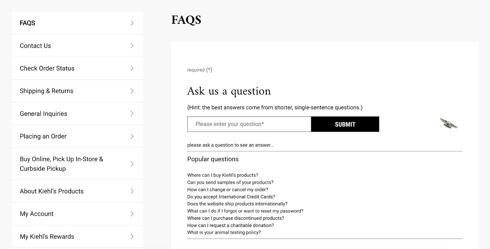
The page also includes links to popular questions so users can get answers quickly.
8. Yasso
This frozen yogurt brand’s FAQ page starts with a number of clickable category links:

If you click on one or scroll further, you’ll find a drop-down menu of more specific questions:

This FAQ page uses brand colors and design. To further encourage brand recall.
How to Create an Effective FAQ Page
Create an FAQ page that drives traffic and helps customers. With these five tips.
Uncover Questions Your Customers Actually Ask
The primary goal of your FAQ page is to answer your customers’ and potential customers’ questions. So that they don’t need to contact your support team every time they need help.
There are two ways you can uncover what those questions are:
First, ask your customer support and sales teams.
Those two teams coordinate with customers on a daily basis. Ask them to compile recurring questions. And add those questions to your FAQ page.
If you’re using help desk or call center software like Intercom or Zendesk, review the customer data.
This includes listening to recorded calls, looking through written details about specific customer issues, etc.
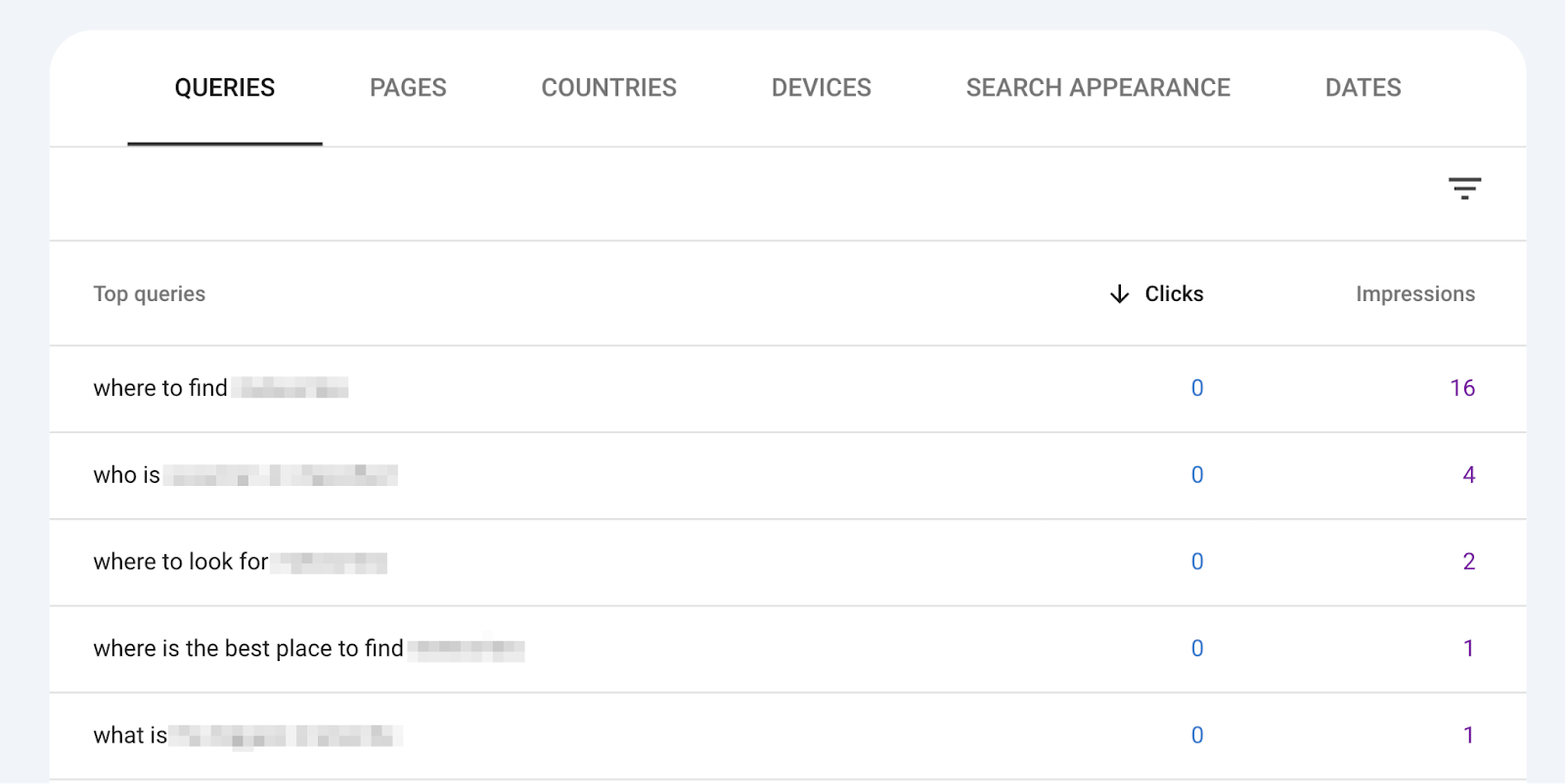
Second, use Google Search Console. To see questions that you’re already ranking for.
Sign in to Search Console and select your site in the property drop-down.
Next, click on the “Performance” tab in the left-hand navigation menu.

And scroll down to “Queries” to see a list of search terms that you’re already ranking for.

Now, let’s narrow that list of queries. Into a list of question keywords.
Create a filter by clicking “+ New” > “Query…” at the top of the screen.

And, hit “Custom (regex).”

Finally, paste the following expression into the open field. And click the “Apply” button.
^(how|what|when|where|who|why)[" "]
The table will show you all question-based search queries.
Comb through the list to choose the most relevant questions for your business. And add them to your FAQ page.
Research Question Keyword Opportunities
Keyword research can help you identify questions people enter into search engines.
Start your research by plugging your industry or brand name into the Semrush Keyword Magic Tool.
Let’s use the cosmetics company Lush to demonstrate.
Enter the brand name, choose your target country, and click the “Search” button.

You’ll see a list of keywords related to “Lush.”
Click the “Questions” filter button near the top left-hand corner of the report.
And click on the “Volume” column to arrange by search volume (i.e., the estimated number of searches a keyword gets per month).

Now, you’ll see a list of questions related to your brand. With the keywords that get the most searches per month at the top.

As you did with Search Console, choose the most relevant questions for your business. While considering their search popularity.
Follow a Logical Category Structure
A great FAQ page is easy to navigate. So that visitors can find what they need as quickly as possible.
To do that, create clear category sections based on the question type.
For example, the Shopify FAQ page categorizes questions into four sections. In a left-hand navigation menu:

Some common FAQ categories include:
- General questions
- Account and registration
- Ordering and payment
- Shipping
- Returns
- Product information
- Technical support
- Privacy and security
- Contact information
Answer Questions Clearly and Concisely
When visitors land on your FAQ page, they’re likely looking for quick answers. So keep your answers clear and concise.
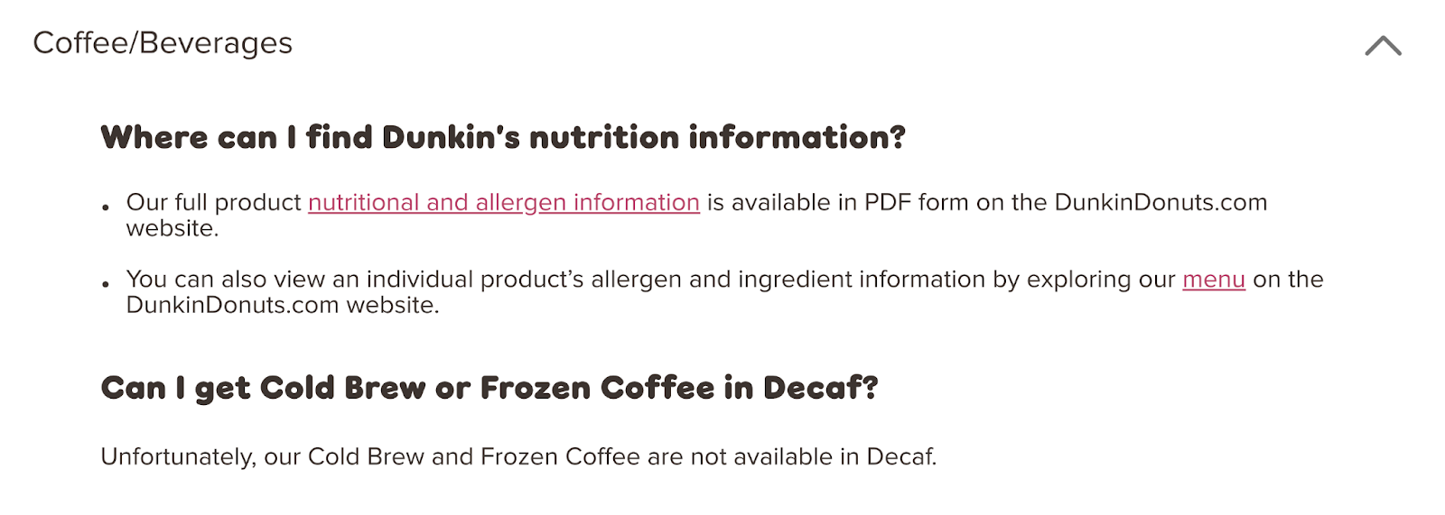
Let’s take Dunkin’s FAQ page. Many of the answers are one or two sentences. And get right to the point.
Consider User Experience
If you want your site visitors to leave happy, improve your FAQ page's user experience.
Add helpful elements like search functionality and drop-down menus to make your page easier to navigate.
People will land on your FAQ page with a specific question in mind. Make it easy for them to find answers by adding a search field (especially if your page is too long to skim).
For example, here’s the IRS’ FAQ page with a search bar at the top:

You can also include drop-downs within your categories.
Adobe breaks up their left-hand navigation categories with drop-down arrows. This allows them to include a lot of information on one page without confusing or overwhelming the user.

Create Better FAQ Pages with Semrush
An FAQ page is a beneficial asset for both your site visitors and SEO. But for it to be effective, you need to optimize it properly and include the right questions.
Inspired by the FAQ page examples in this guide?
With Semrush’s suite of tools, you can create an FAQ page that meets users' needs and ranks well in the search engines.
Sign up for a free account today!
This post was updated in 2024. Excerpts from the original article by Kelly Lyons may remain.
