What Is a Call to Action (CTA)?
A call to action (CTA) is a visual prompt—usually text or a button—that directs a user to take a specific action. Like “Buy Now” or “Subscribe.”
Calls to action appear all over the web. Like this clothing website that encourages people to shop:

And on social media. Like this Facebook ad. It asks people to download a report:

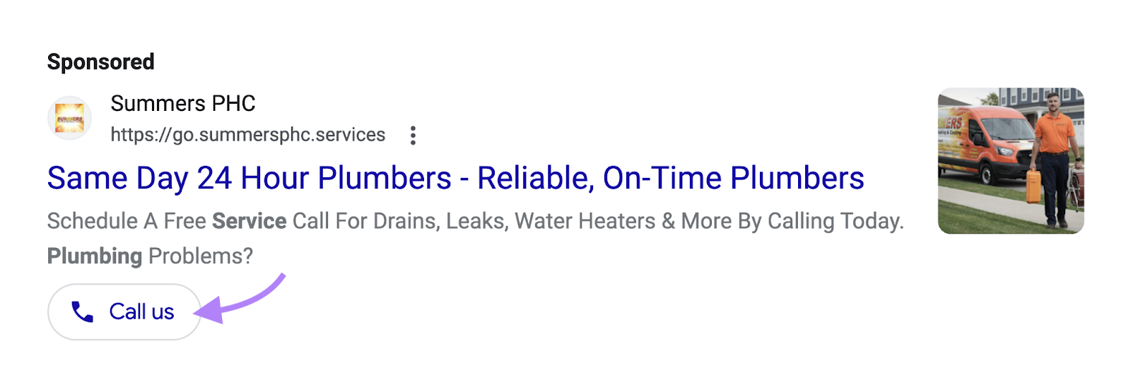
You can even spot CTAs in search ads. Here’s one that asks people to call:
Ready to get inspired? Let’s take a look at 30 incredible call to action examples, sorted by type.
Informational CTA Examples
Informational CTAs lead to pages that provide additional information on your products, services, or business.
Like a product page. Or an “About Us” page.
They typically include phrases like “Learn More,” “Read More,” or “Explore.”
Let’s dive into some attention-grabbing examples.
1. Mailchimp
Mailchimp’s CTA gives users a glimpse of what they’ll discover by clicking the link. In this instance, the invitation is to “Explore 300+ Integrations.”
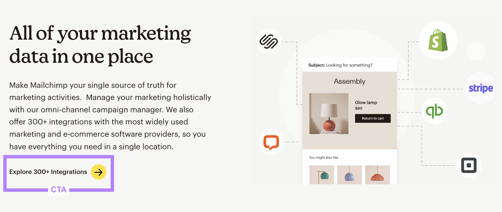
Using a number emphasizes Mailchimp’s extensive integration capabilities. And reassures users that adding Mailchimp to their tech stack should be a pain-free experience.
So, when writing your informational CTAs, see if you can include numbers. Here are some examples:
- To emphasize credibility: Read reviews from # customers
- To emphasize thought-leadership: Access # expert guides
- To emphasize accomplishments: View # completed projects
2. Apple
Apple uses a CTA in their Google search ad that asks people to “Explore the lineup” to learn about the various computers they offer.
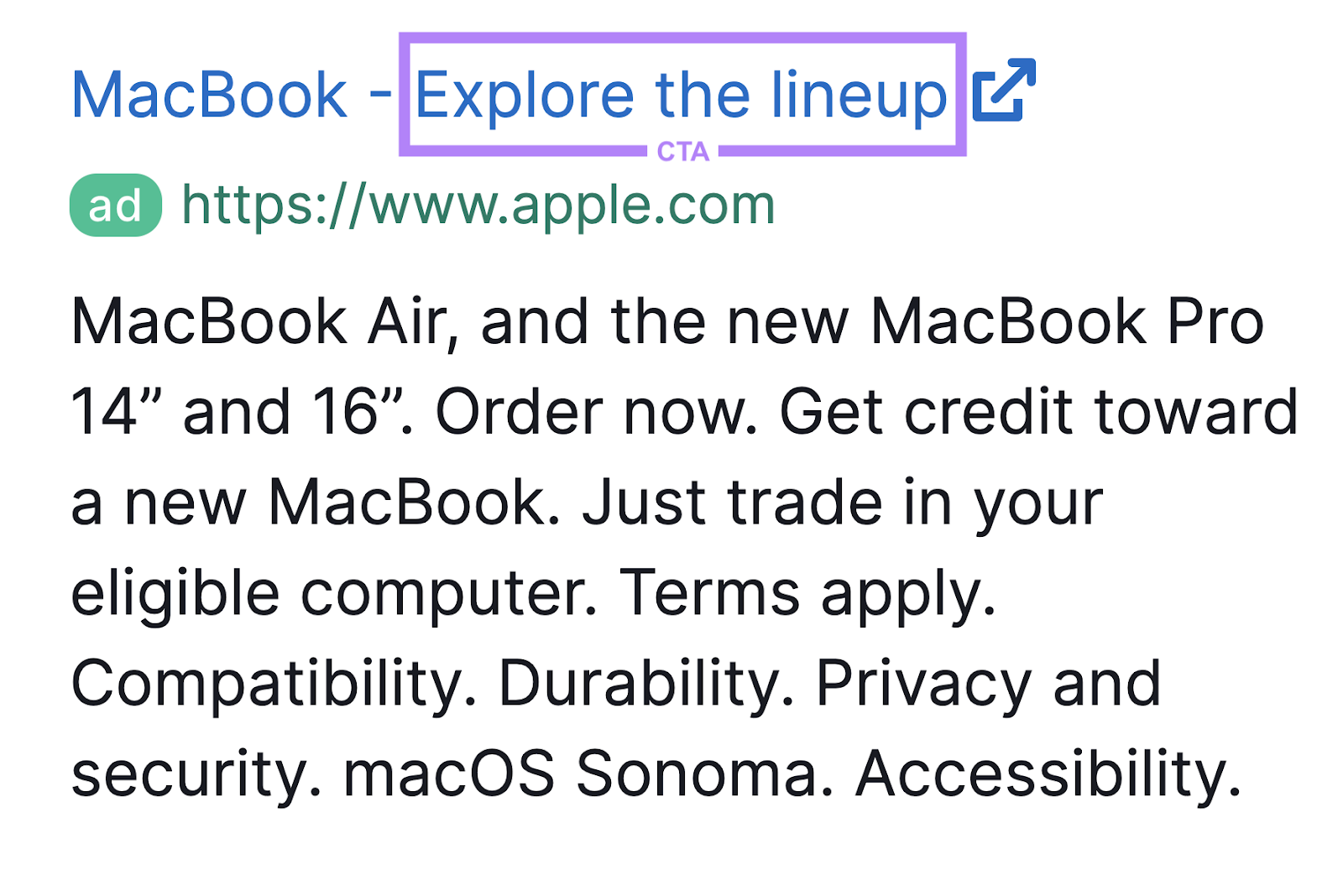
You can get plenty of CTA inspiration by reviewing your competitors’ ads.
Here’s how.
Use Semrush’s Advertising Research tool to pull all your competitors’ search ads over the years. Enter their URL and click “Search.”
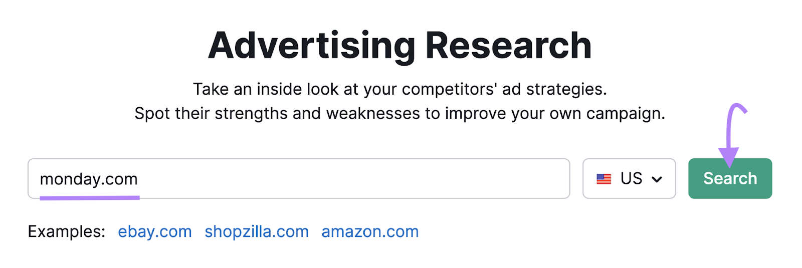
Then click the “Ads Copies” tab to view ads. (Change the date if you want to view past ads.)
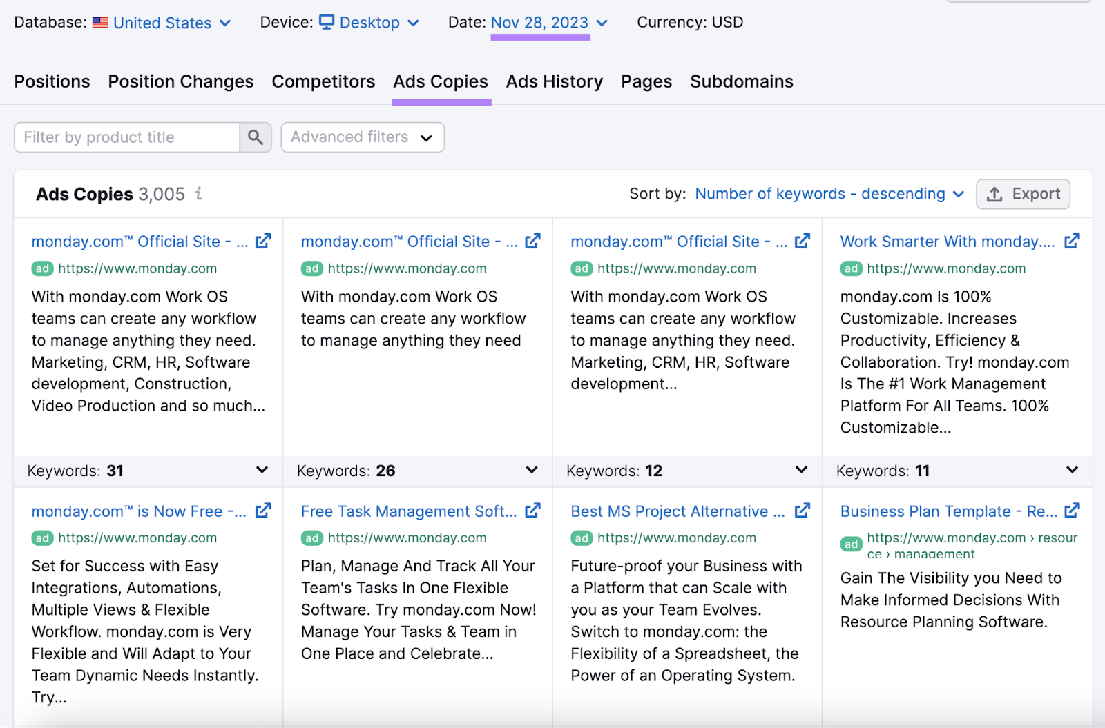
Go through these and get inspiration for your own CTAs. Consider noting what your competitors are advertising and how they frame their CTA.
For example, if they advertise a free trial, do they mention how long the trial is?
When writing your CTAs, use what you learn from your competitors to come up with a few different options. Then test to see which ones perform best.
3. Sakuraco
Subscription box company Sakuraco has multiple CTAs in their Facebook ad:
- Learn more (button)
- Find out more (link)
- Discover Japan’s Authentic Sweets
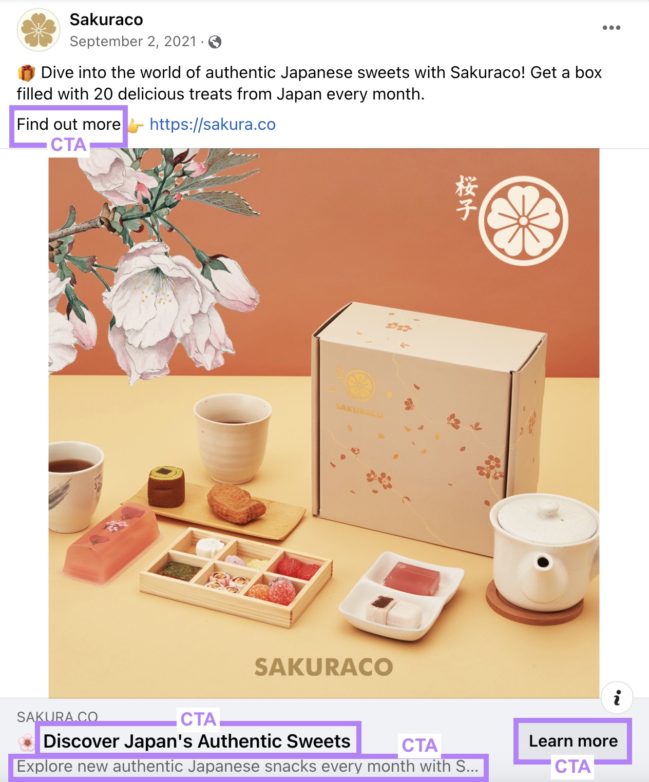
Although Sakuraco has multiple CTAs, they all follow a similar pattern. And that pattern encourages users to click for more information.
Experiment with multiple CTAs when writing ads for Facebook. Like a CTA in the headline and in the primary text.
But like Sakuraco, keep all your CTAs related to the action you want the user to take. Otherwise, they may get confused. And they won’t know what you’re asking them to do.
4. Tiffany & Co
Jewelry company Tiffany & Co prompts visitors to follow their diamond’s journey with their CTA.

This CTA may work better than a standard “Learn More” as it tells users exactly what they’ll learn by clicking the link. And it’s directly related to the products they sell.
To write a CTA like this, ask yourself, “Why should someone click this link?”
Then, mold the reason into a CTA.
5. Warby Parker
Eyeglass supplier Warby Parker infuses their personality into their CTA. Instead of instructing users to “Learn More,” they’ve taken a different approach and asked users to “Peruse the palette.”

When writing your CTA, think of your brand’s voice (the personality you use to communicate with your audience).
Then, like Warby Parker, dress up your CTA with words and phrases unique to your brand.
6. Starbucks
Coffee company Starbucks uses a descriptive CTA that tells users where they’ll go after they click. Which is a page with examples of inclusion and diversity.
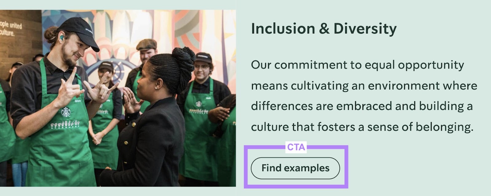
This type of CTA can drive traffic to a page that compiles resources. Like blog posts, case studies, testimonials, or examples.
To drive traffic to these types of pages, try CTAs like:
- Discover what our customers say
- Read our case studies
- Browse our blog
Lead Generation CTA Examples
Lead generation CTAs collect leads from your website by asking users for their email. These CTAs usually say something like “Subscribe” or “Sign Up.”
Here are some examples of lead generation CTAs to inspire your own:
7. Reformation
Clothing company Reformation has two CTAs in their opt-in form:
- “Sign up to see for yourself”
- “Give us your email address. Promise we won’t spam.”
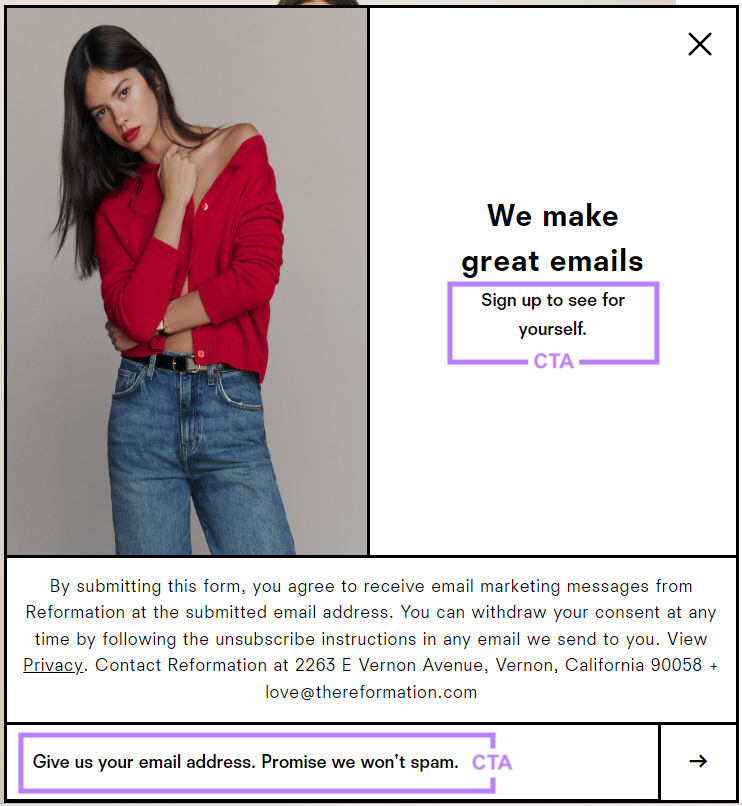
The first CTA piques the user’s curiosity.
You can incorporate a CTA like this in your lead generation forms by telling the user why they should sign up for your email list.
The second CTA tries to eliminate any doubts the user might have. In this case, the doubt is that the emails will be spammy.
Get to know your subscribers and identify their initial reservations when subscribing to your list. Then, create a CTA that addresses their concern to put future leads at ease.
8. Boom! By Cindy Joseph
Makeup brand Boom! By Cindy Joseph uses the CTA “Join The Club” to ask people to sign up for their email list.
The last line is also a simple but effective pun. This playfully adds a sense of urgency, suggesting that “joining the club” is long overdue.

This CTA fosters a sense of community. If you want to give your email list a community-feel, try a CTA like this:
- Join the inner circle
- Be part of our network
- Become an insider
- Join our community
9. Brian Kurtz
Copywriter Brian Kurtz takes a different approach to the usual “Subscribe” CTA. His CTA button explicitly tells subscribers what they get in return for giving him their email address.
In this case, they get a document with direct marketing secrets.
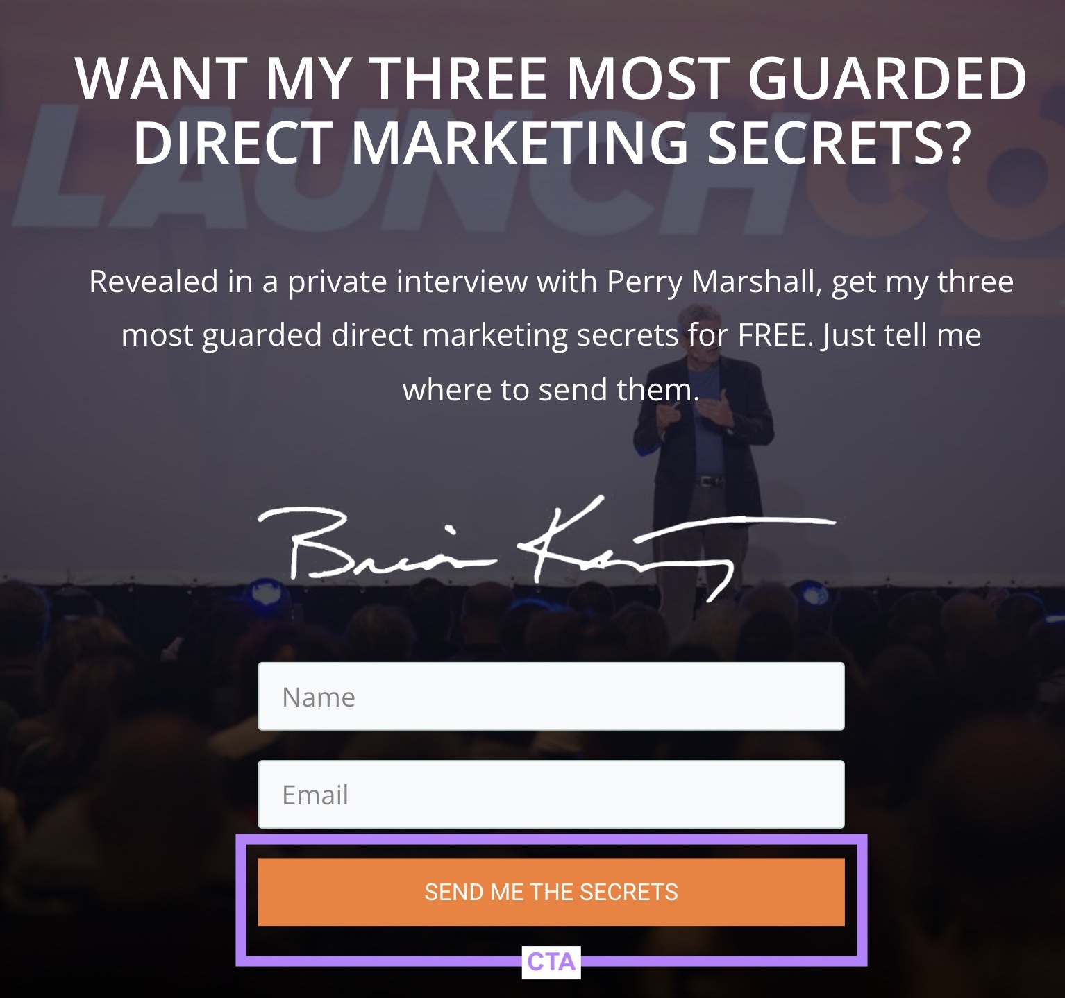
Consider replacing your “Subscribe” CTAs with something like Brian’s CTA. And tell the user what they get in return.
Try something like:
- Send me the [item]
- Give me the [item]
- I want the [item]
- Get the [item]
Form Submission CTA Examples
Form submission CTAs require users to fill out a form—usually to contact you or book a meeting. These CTAs might read “Contact” or “Submit.”
But you can get more creative with it.
Here are some examples of effective form submission CTAs:
10. Impact
Marketing training company Impact offers free coaching sessions for those who fill out their form.
Rather than a generic CTA like “Submit,” they use “Book Your Free Coaching Session.”

This makes the purpose of the form clear. And users know this form isn’t for contacting and asking questions.
You can use a similar approach by writing a CTA that tells users what happens if they fill out a form. Like “schedule a consultation” or “book a meeting.”
11. Choice Screening
Background screening company Choice Screening uses a CTA that tells users that filling out the form puts them in touch with a person. As opposed to an automated reply or a support chatbot.
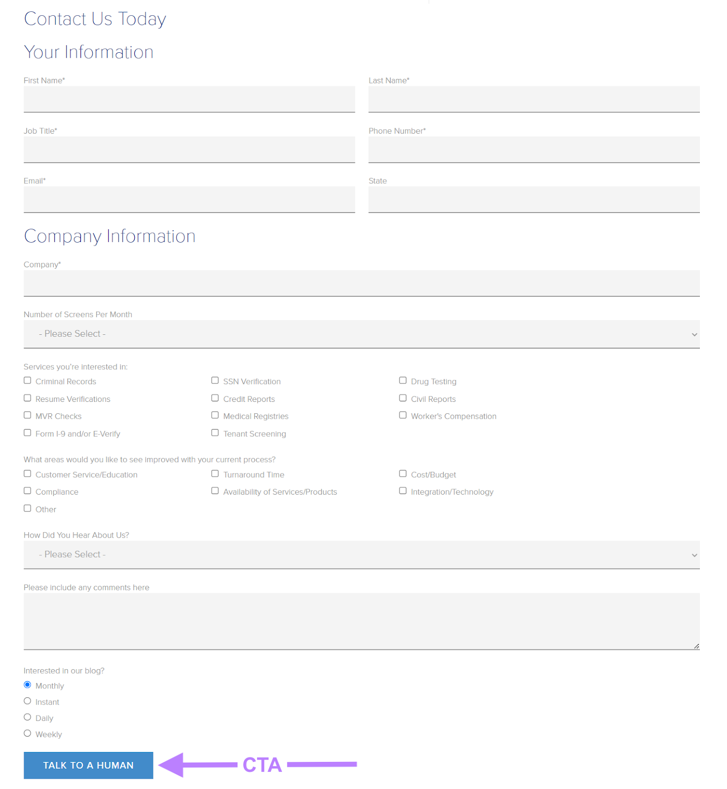
Use your form submission CTA to highlight who users can expect to speak with after they submit your form.
Try CTAs like “speak to a specialist” or “talk with our team.”
12. Zendesk
This call to action button example from support company Zendesk reaffirms who the user is contacting.
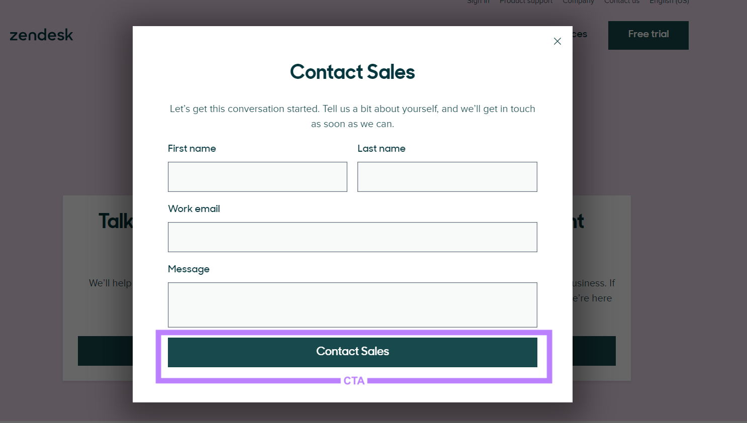
If this form was titled “Contact Form” and the button said “Send” rather than “Contact Sales,” someone might fill it out hoping to reach support.
However, this CTA eliminates confusion. And ensures people send their messages to the right place.
Try this approach if your site has multiple forms that connect to different teams.
Engagement CTA Examples
Engagement CTAs aim to engage and interact with the user. They often involve actions like “Take a Tour,” “Watch Video,” or “Start Free Trial.”
Here’s how brands write attention-grabbing engagement CTAs:
13. Biteable
This CTA from video software solution Biteable reads “Make an explainer video” instead of something like “Sign Up.”
This way, people know what they can achieve by clicking the button.

To create a CTA like this, tell people what they can do with your product or service if they click the button or link.
14. EventBrite
Event management website EventBrite highlights the benefits of their service with their CTA.

This CTA tells users that they can grow their events by signing up with EventBrite.
If you want to write a CTA like this, ask yourself what benefits users can realize by following through with your CTA.
Will they get more confidence? Grow their business?
After defining the benefit, use it as your CTA.
15. Duolingo
Here’s another benefit-focused CTA from the learning app, Duolingo.

Their CTA tells people that clicking the link will help them improve in math.
A benefit-focused CTA can be effective if the landing page aligns with the highlighted benefit.
In the CTA example from Duolingo, the button leads users to a page to download the Duolingo Math app.
16. Nike
This QR code call to action example from Nike demonstrates how you can use CTAs in unique ways.
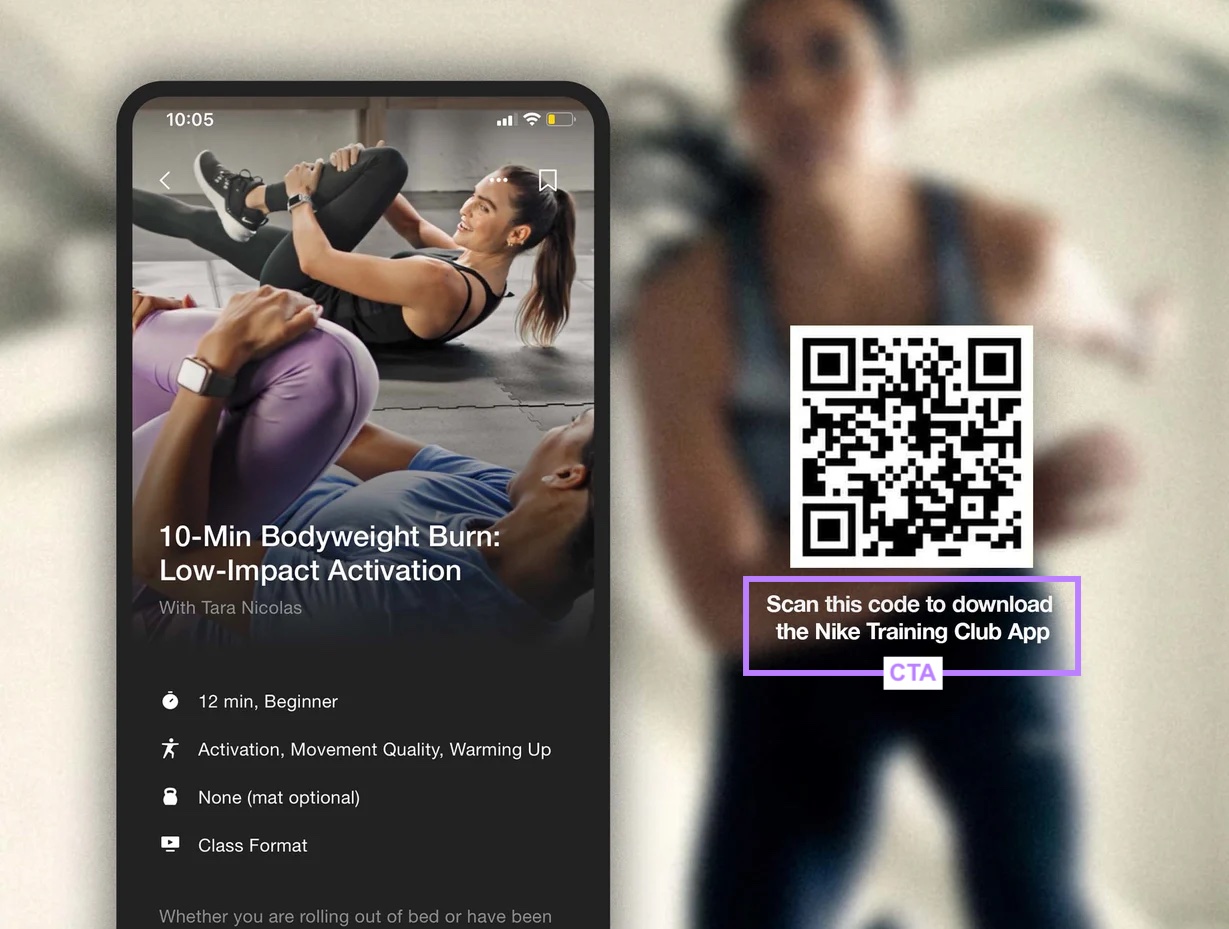
If you use QR codes on things like posters or menus, add a CTA near the code. Nike adds theirs underneath the QR code.
You could also experiment with adding your CTA above or beside.
Either way, your CTA should describe what happens when someone clicks the link attached to the code.
In this case, the QR code directs people to download an app (as Nike describes).
17. Kiva
Kiva is a platform that connects lenders with borrowers. Their CTA tells readers they can “find a borrower” (people who need money for projects).

To write a CTA like this, clearly and concisely describe what people can do after they click the link.
Sales CTA Examples
Sales CTAs drive purchases and use phrases like “Shop” or “Buy Now.”
Let’s look at a few other options.
18. Crate&Barrel
Home decor company Crate&Barrel replaces “Shop Now” with “Bring home joy” for their CTA.

Try replacing your “Shop Now” CTAs with something more descriptive. And tell users what they can get if they buy your product.
In Crate&Barrel’s example, shoppers can add joy to their homes with their decor. This is more appealing than simply saying something like “Go to shop.”
19. Wool and the Gang
Knitting company Wool and the Gang sells knitting kits. Instead of a CTA like “Shop,” they instruct users to “Choose a Kit.”
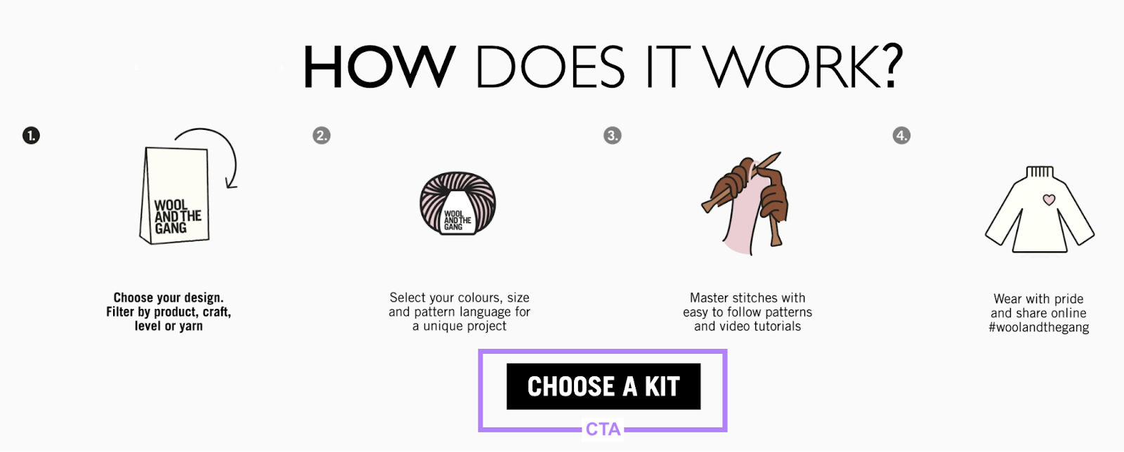
Adding “choose” to your CTA tells users they have various options. And they can find a product that suits their needs.
Try a similar CTA when directing users to pages with multiple products or various pricing packages.
20. James Wedmore
Business coach James Wedmore makes a promise with his CTA:

He gives users a reason to click his CTA by telling them what they can achieve with his product—upgrading their sales pages.
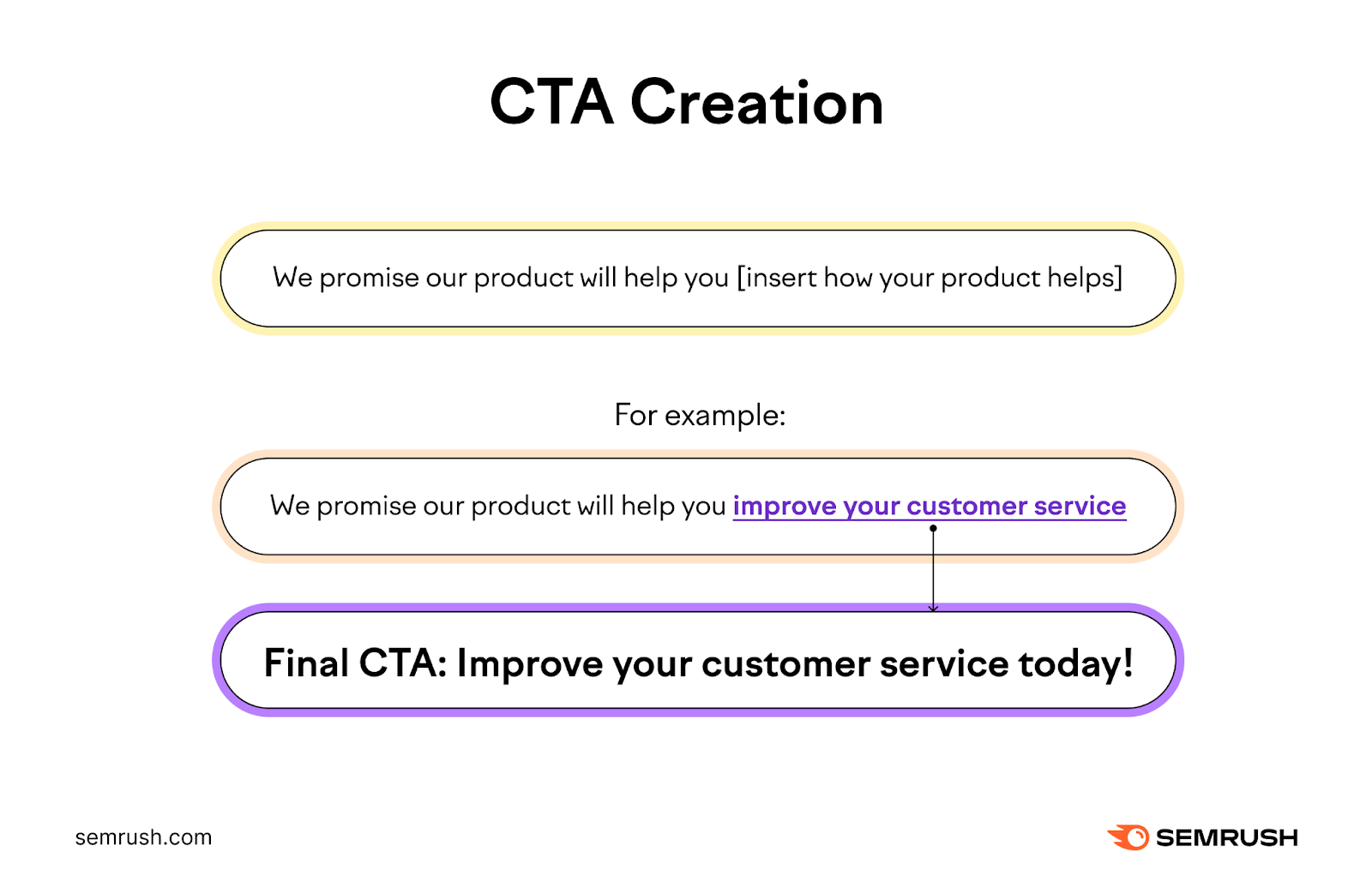
If you’re unsure of how to adapt this to your own call to action, finish this sentence: “We promise our product will help you…”
Then, turn the second part into your CTA. Like this:
- We promise our product will help you improve your customer service
- CTA: Improve your customer service today
21. VistaPrint
Printing company VistaPrint relies on one CTA for their Facebook ad: The “Shop now” button.
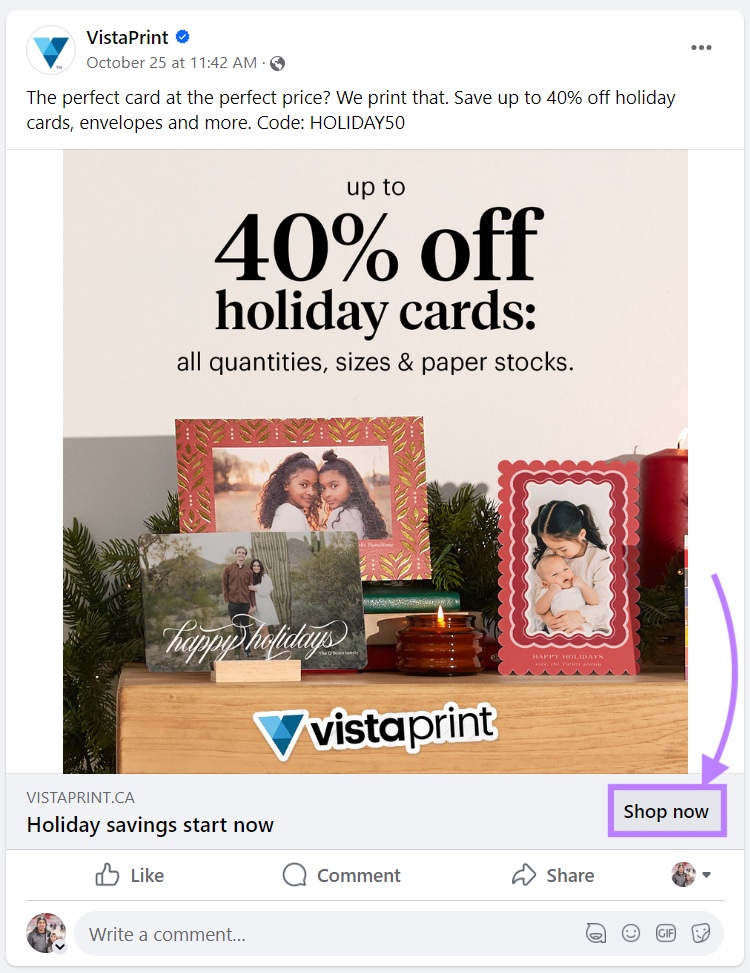
Rather than fill their Facebook ad with multiple CTAs (like in the example from Sakuraco), they use the copy to highlight the details of their sale.
Like the discount customers get. And which code to use.
Test your Facebook ads to see how many CTAs work best with your audience. You might find one is the most effective. Or that multiple CTAs perform best.
22. Fenty Beauty
Cosmetic company Fenty Beauty uses a festive CTA (“Play The Part”) to advertise their Halloween products.

And by adding when the sale ends (in this case, October 31), they add a sense of urgency to the CTA.
Consider how you can tie your CTAs to holidays and other events.
Keep in mind that this approach might not work for all businesses.
For example, a festive CTA might come across as unprofessional for a law firm.
23. Hulu
These two CTAs on the welcome page for streaming service Hulu are straight to the point.

The user immediately knows which package has two channels and which has three. This is far more informative than if both buttons just said “Buy Now.”
This can make it easier for prospects to make a decision.
Use a CTA like this if you have fewer than three products/options. So users can quickly spot the one they want to buy.
Social CTA Examples
Social CTAs ask people to interact with your brand via social media.
Like a CTA that asks people to share a post on Facebook. Or one that asks people to follow you on Instagram.
Here are a few more examples:
24. HubSpot
Software company HubSpot includes this CTA at the bottom of their blog posts.

Adding text with social share icons underneath is a simple way to ask people to share your content.
Here are some other examples:
- Share this post with your friends
- Enjoyed this content? Share it to spread the knowledge!
- Know someone who would benefit from this? Share it with them!
25. Memberpress
WordPress plugin Memberpress also adds a CTA at the end of their blog posts.
But instead of asking people to share their content, they ask users to follow them on social media.

By adding links to each social profile, users can easily find Memberpress’s socials to stay connected.
26. Vani Hari
Food blogger Vani Hari asks followers on Instagram to share each recipe with their friends.

Adding these CTAs to your social posts can increase your reach by encouraging those already engaging with your content to share it with their network.
Support CTA Examples
Support CTAs help users find what they need. Like a support channel.
Examples of these include “Contact Us” or “Get Help.”
Here are some examples of support CTAs:
27. Event Connect
Sports software company Event Connect uses this CTA for their live chat:

This CTA tells people that a live chat will open if they click the link.
Being direct with your support CTAs helps people find the avenue of support they want. For example:
- Call us now
- Send us an email
- Start live chat
28. Staff Renter
Staff Renter is a recruitment firm. On their contact form, their CTA reads “Ask your question” rather than something generic like “Submit.”
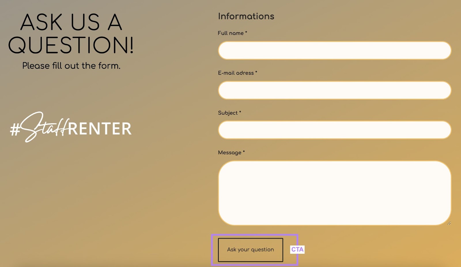
You can try similar CTAs for your contact form like:
- Reach Out
- Get in Touch
- Connect with Us
- Request More Information
Donation CTA Examples
Nonprofits use donation CTAs to ask for gifts and contributions. They usually say something like “Donate Now.”
Here are a few more examples:
29. Interior Wildlife
Wildlife rehabilitation center Interior Wildlife accepts multiple types of donations. And they make it easy for donors to find their preferred method by clearly labeling each CTA.
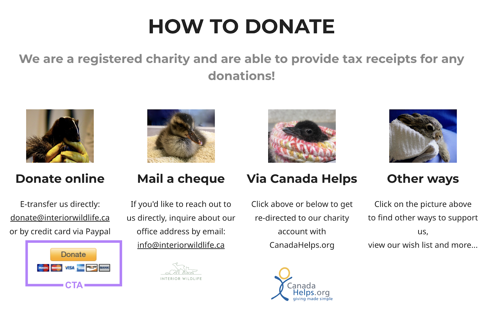
These clear CTAs help people quickly find a donation method that suits their needs.
30. With You
Charity With You also lists two CTAs for collecting donations: One for recurring donations and another for one-time donations.

Using multiple CTAs gives people a choice of how often they’d like to donate.
How to Write Effective Calls to Action
The best way to write CTAs is to ask yourself what users get if they follow through on your CTA.
For example, if you sell language courses, your CTA could be something like “Become Fluent in French.”
You can also see what your competitors have used for their CTAs. Browse their websites (including their homepage, landing pages, and sales pages) and their ads to get inspiration for your own CTA.
To view your competitors’ ads, use the Advertising Research tool.
You can also use Ads History to view a list of ads within your niche. Enter a keyword related to your niche and click “Search.”

Click on the number to reveal different ads and review the CTAs they used.
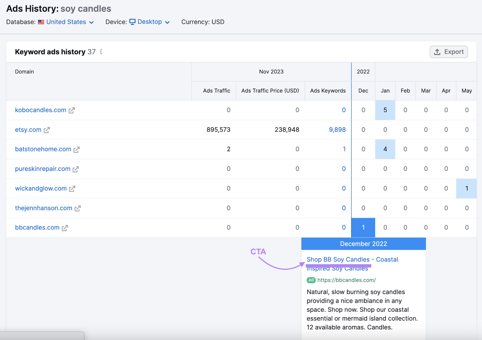
This gives you an archive of examples you can use to inspire your own CTAs.
Ready to try it for yourself?
Sign up for a free Semrush account and get inspired to write your next CTA.
